About Dashboard

Dashboard allows you to analyze metric and log data on the same dashboard, in a streamlined user experience. This is exactly what you need to effectively monitor and manage a Kubernetes environment.
Dashboards are a critical tool for monitoring and troubleshooting modern applications, allowing you to quickly navigate through your data without having to learn a query language. Graphs and data mappings provide visual representations of data that enable you to quickly identify and resolve key issues.
What's great about Dashboard
Dashboard provides the unique ability to display metrics metadata and logs data on the same dashboard in an integrated seamless view. This gives you control over the visual display of metric data as well as log data. Dashboard streamlines dashboard configuration and on-the-fly analytic visualizations with its new templating features.
Template variables allow you to filter dashboard data dynamically to generate new visualizations for intuitive chart creation and data scoping.
Features
- Dashboard template variables provide full replacement control over what is inserted, and the variables work across both log and metric panels.
- Dashboard provides a dashboard-first view to build, maintain, and interact with dashboards. With Dashboard you can build panels inside the dashboard rather than adding panels from the Search or Metrics pages.
- Dashboard utilizes the Metrics Explorer with full text auto-complete capabilities, so you can quickly find the metrics you are looking for.
The following table shows the availability of features for Dashboard.
| Feature | Dashboard |
|---|---|
| Filtering a Dashboard | Template Variable Based Filters with greater control on filter values, data type, and acceptable input. |
| Adding Queries to Dashboards | Add a panel from Search or Metrics Ability to add panels inline through Add a Panel button |
| Log Visualizations | Area Bar Box Plot Bubble Cluster Map Column Combo Connection Map Funnel Geo Heat Map Heat Map Honeycomb Line Pie Sankey Diagram Scatter Single Value Table |
| Metric Visualizations | Area Bar Box Plot Bubble Cluster Map Column Combo Connection Map Funnel Geo Heat Map Heat Map Honeycomb Line Pie Sankey Diagram Scatter Single Value Table |
| Text Panel | Supported |
| Real Time Dashboarding | Auto Refresh |
| Dashboards as Wall Monitors | Public Dashboards Whitelisting |
| Dashboard Sharing with Variables and Time Range preserved | Supported |
| Dashboard Content Item Sharing | Supported |
| Run As Creator / Data Access Level Control | Supported |
| Dark Theme | Supported |
| Configured Dashboard Linking | Supported |
| Recommended Dashboards & Logs Drilldowns | Supported by clicking on data points or slices/sections of pie charts, bar charts, column charts, area charts, and line charts. Learn more. |
| Combined Metrics & Logs Panel | Supported. See how to overlay logs and metrics in a panel. |
| Styling Queries and Series | Ability to style through display overrides inside the panel settings. Ability to set the color per query/series. Multiple layers of expressiveness for display overrides. For details, see how to modify a chart. |
| Colors by Value Range | Supported |
| Export to PDF/PNG/JSON File | Supported |
| Scheduled Dashboard Report | Supported |
| Link Dashboard to Your Stack | Supported |
| Locate Deviations in a Time Series | Supported |
| Longer Time Range Queries | Supported |
Restricted Operators in Dashboard
The following operators cannot be used with Dashboard:
- Details
- LogReduce
- LogCompare
- Save
- Transaction
Live mode restrictions do not apply to Dashboard.
Limitations
- A panel can have up to 6 logs and 6 metrics queries.
- Joining log queries in a separate query is not supported. See how to join metric queries for details on how this works.
- A Dashboard can have up to 100 queries.
- Dashboard chart properties are not retained when viewed from the Search page.
- Chart properties are not retained when a chart is added to a Dashboard from the Search page.
- Dashboard queries cannot return more than 1440 data points.
Rules
- Auto Refresh applies to the whole dashboard, you cannot configure it by panel.
- If there are two or more queries in a panel, the refresh interval for the panel is set to the maximum supported interval.
- If the requested refresh interval is not possible, you'll get an error message indicating the actual refresh rate is slower than requested. This can be due to one of the following reasons:
- The time range is too long to refresh at this rate. Reduce the time range to allow a faster refresh interval.
- An operator is not supported at this refresh interval.
- The number of grouped elements is too large for the requested interval.
Auto Refresh
Your dashboard can automatically refresh its panels to the latest information. You have the ability to configure the refresh interval rate by clicking the dropdown arrow next to the refresh icon.
There are some restrictions when using operators with dashboards. To learn more, see Restricted Operators in Dashboards.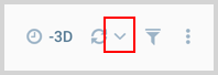
A list of the refresh interval rates is provided for you to select from.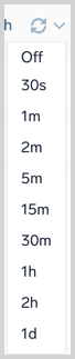
Dark Theme
Dashboards have two themes available: Light mode (which is the default) and Dark mode. You can toggle between the two themes within the dashboard by clicking the three-dot kebab icon. The following image shows the option to Switch to Dark Theme.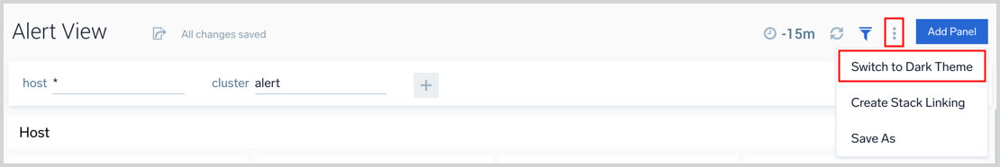
Clickable Legend
If you want to focus on one item in your chart you can simply click on the item in the legend. If you want to toggle just one legend item, just hold the shift key and then click the item.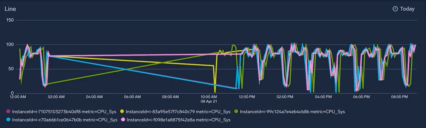
Dashboard Information
The dashboard information popup provides insights into the scan costs associated with log-based queries that run within dashboards.
To view the dashboard information, follow the steps below:
- Open the dashboard for which you need to view the information.
- Click the three-dot kebab menu icon in the top right corner of the dashboard and select Info from the dropdown menu.
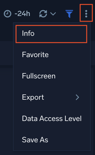
- A popup pane will appear, displaying the following dashboard information:
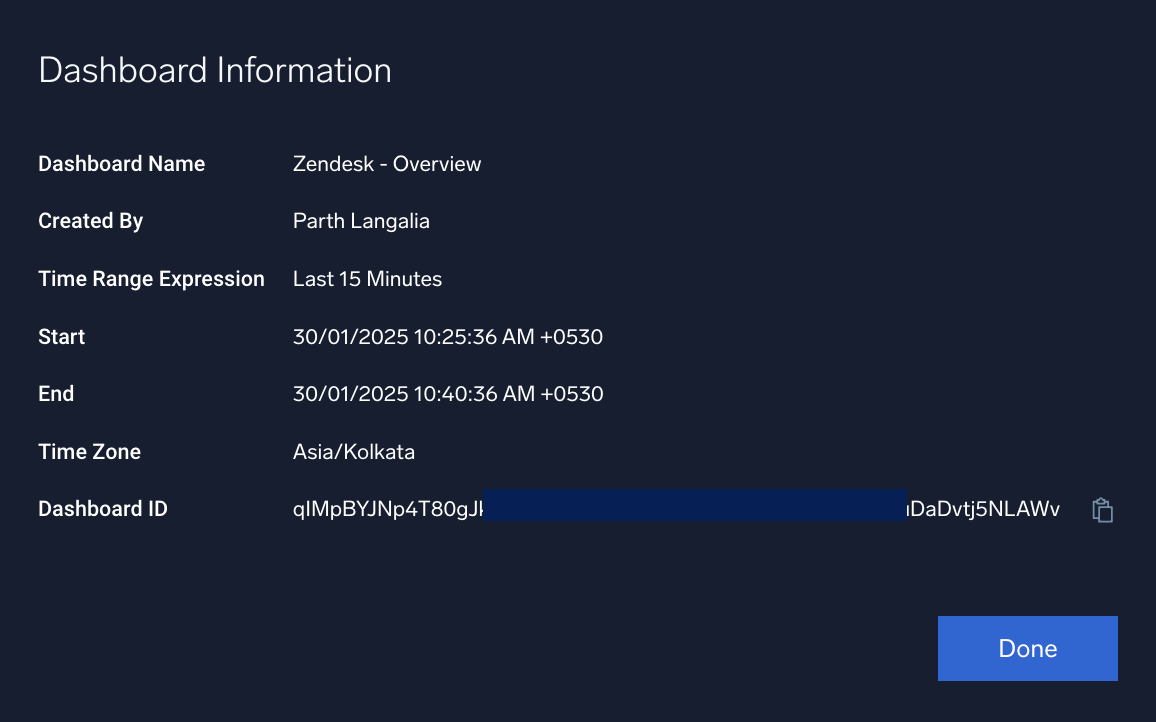
- Dashboard Name. Name of the dashboard.
- Created By. The user who created the dashboard.
- Time Range Expression. The time range selected for the dashboard.
- Start. The current start time based on the selected time range.
- End. The current end time based on the selected time range.
- Time Zone. The time zone for the set time range.
- Scanned Bytes. The total amount of data scanned in bytes.
- Dashboard ID. A unique identification ID for the dashboard. Copy and use the dashboard ID within the APIs to identify the dashboard when making requests.