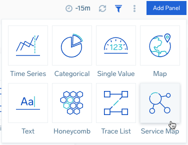
Dashboard Panels
Panels are the building blocks used to create a dashboard. Each panel displays analytics for a specific query. The type of panel you choose to display your data depends on the type of query you want to run.
Related topics:
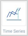
Time Series Panel
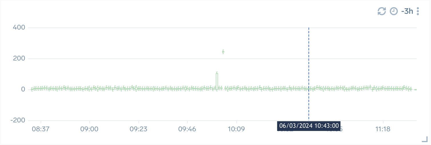
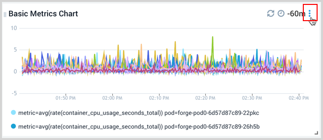
Time series panels provide information on a series of data points ordered in time. Typically, a time series is a sequence taken at successive equally spaced points in time. Examples of time series are CPU and Memory over time.
In a time series, time is often the independent variable and the goal is usually to make a forecast for the future. Time series are frequently plotted with area or line charts.
These are best used for looking at statistics taken over time. Things like CPU, Memory, and disk usage statistics fall into this category.
Time series panels accept aggregate fields with epoch values (milliseconds since 1970).
Log queries can use the timeslice operator to provide a time series.
Available chart types:
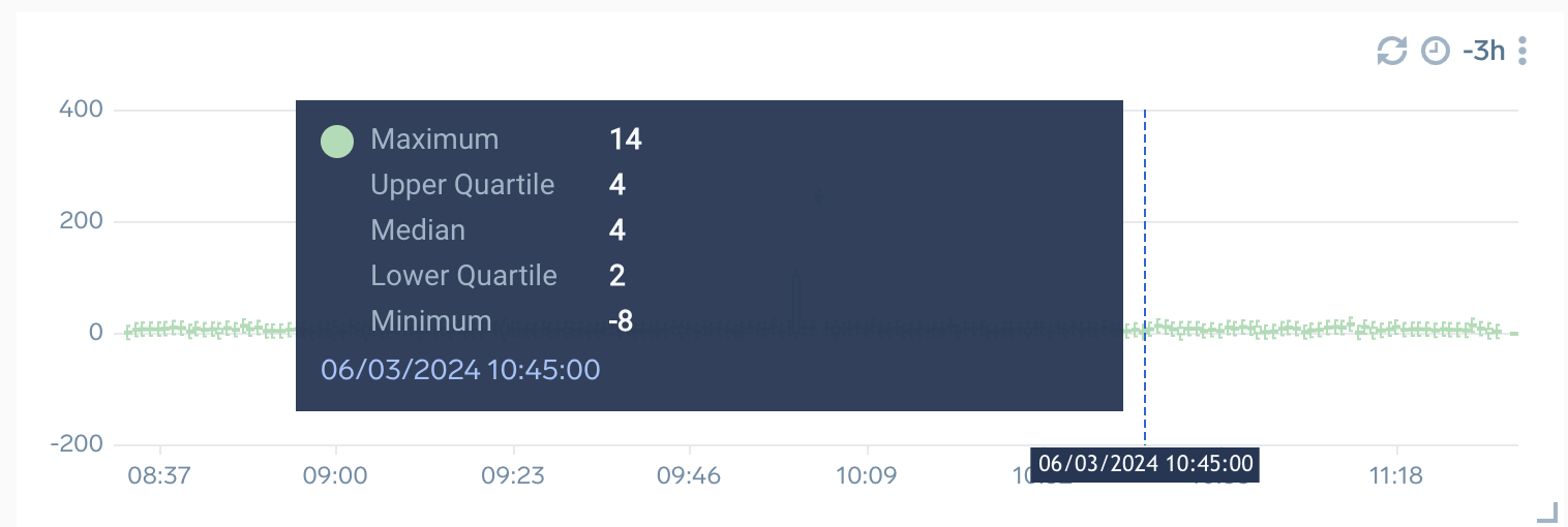
When you move the cursor over the Line, Column, Bar, Area, and Box Plot time series panels, you can see a crosshair line across the panel which displays the time-series data. If other time series panels are also configured with overlapping time range, then when you hover over one time panel, crosshair timestamp will be displayed on the other panels as well. A tooltip is used to display the time-series data along with the crosshair, which also displays information about the combination chart.
Crosshair timestamps are not available for Heatmap, Table, Categorical, and Honeycomb charts.
As a dashboard user, you are allowed to modify the time range for the selected panel or for the entire panels in the dashboard. To know more, refer to Set Custom Time Ranges.
What is the difference between a categorical and time series panel?
The categorical panel type contains charts that graph data across categories. This includes:
- Line Charts
- Area Charts
- Bar Charts over categories
- Column Charts over categories
- Pie Charts
- Funnel Charts
- Tables over categories
- Bubble Charts
- Scatter Charts
- Sankey Diagram
- Box Plot Charts
The time series panel type is designed to graph data over time. Time series panels accept aggregate fields with epoch values (milliseconds since 1970). You can use the timeslice operator to provide a time series.
The types of charts you’ll find in the time series panel include:
- Area
- Bar
- Column
- Line
- Table
- Box Plot
- Heat Map
Categorical Panel
Categorical panels provide information on the number of occurrences (frequency) of distinct values. Categorical frequencies are typically shown in pie, table, and column charts.
These are best used to understand the distribution of data by categories. For example, understanding the number of CPUs used by machine type, or the number of requests handled by a pod.
Available chart types:
The following image shows an example of Scatter and Bubble charts.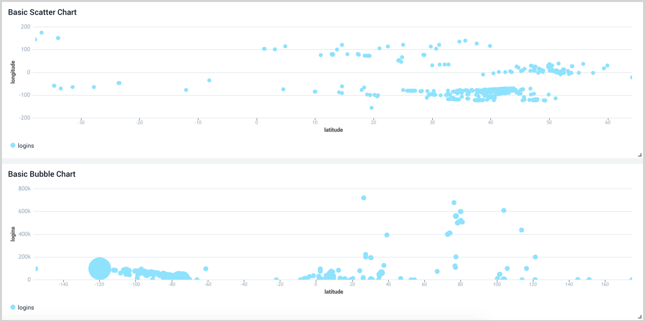
Single Value Panel
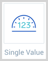
Single Value Panels are great at providing high level overviews. They look great on executive dashboards and can provide at-a-glance information to help decide where to inspect and troubleshoot further.
Only single value charts are supported.
Map Panel
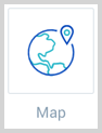
Maps identify where requests are coming from. These are ideal for geolocation data.
You may not see map panels render if hardware acceleration is disabled on your browser.
Only map charts are supported.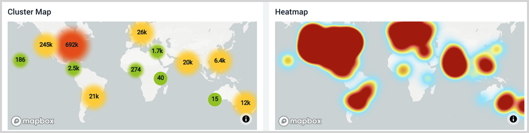
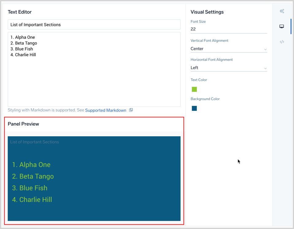
Text Panel
Text can clarify what you are showing on dashboards or act as a note to your viewer. Text panels provide the flexibility to display descriptive text in or above other panels.
Titles are displayed in the same size and font. Text is styled using Markdown syntax, meaning that you can control the size and weight of the text. Not all Markdown syntax options are supported; see Markdown Syntax.
There is no limit to the number of Text Panels you can add to Dashboards. These types of Panels do not count against the quota in Sumo Logic Free accounts.
To add a Text Panel:
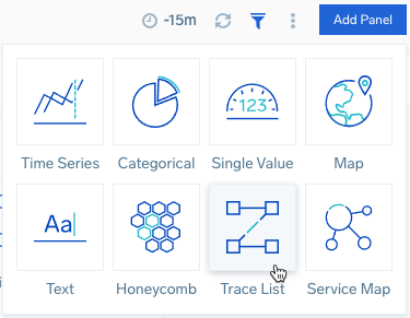
- With the Dashboard open, click the Add Panel button.

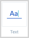
- Choose Text as the Panel Type.
- The Text Editor and Visual Settings are displayed.
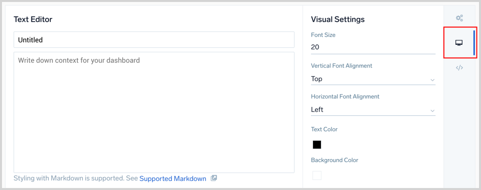
- Input your Text or Markdown syntax in the Text Editor pane. See Markdown Syntax for details on what is supported.
- The Visual Settings options allow you to adjust the font, colors, and alignment of your data.
- A title is optional, you can toggle its visibility in the Panel Details covered in the next section.
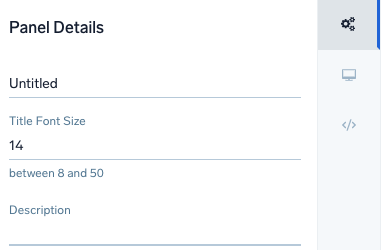
- Next, to set a Title, select the General menu icon to open the Panel Details pane.
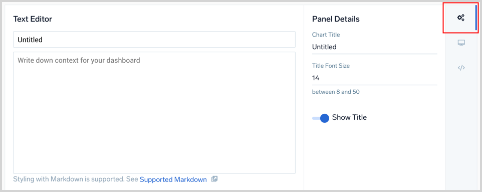 A title is optional. Use the toggle switch labeled Show Title to set if the title is displayed. If desired, enter a title and set the font size.
 - The Panel Preview section displays your text panel based on your settings.
- When you are done, click Add to Dashboard at the top of the window.

Add links to text panels
Text panels can provide links to URLs or other Dashboards with markdown syntax. To create a link to a URL, surround your linked text with square brackets [], then add your URL in parenthesis (), as shown.
To add a link to a Panel in order to drill down to another Dashboard, see Add Dashboard Link.
Syntax
[<Text>](<URL>)
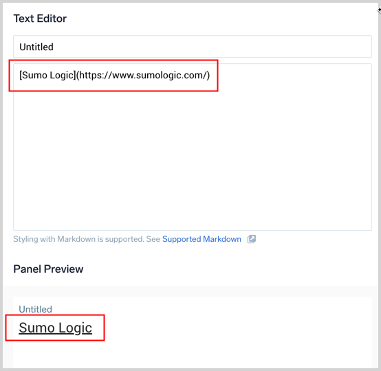
The link is displayed is in the panel.
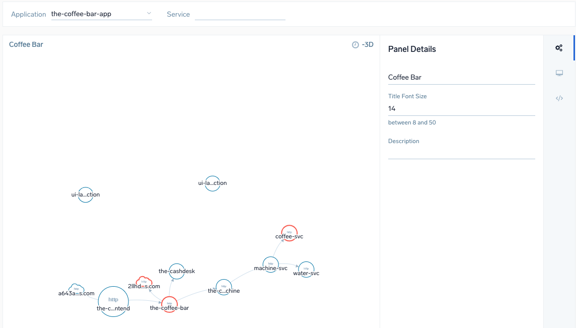
Service Map Panel
The Services List and Map views display high-level views of your application environment, giving you a greater insight into your application architecture and dependencies between monitored microservices.
The panel gives you a fully functioning map to zoom in and out and move through services. The size and color of application entities shows status and activity. Click on a service to open the Entity Inspector to drill down to traces, metrics, and the service dashboard.
You can filter the map according to application and service. See the Dashboard guide for additional information and options to create panels, configure filters, create and filter with template variables from dashboard headers, and more.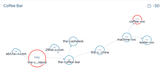
To add a Service Map panel:
- With the Dashboard open, click the Add Panel button and select Service Map.
- A panel configuration page opens.
- Select from the dropdown menus to filter the Service Map by the following:

- Application if your tracing data has the
application=[app-name], tag Service. - To pass the variables from dashboard filters, set
application={{application}}and/orservice={{service}}.
- Application if your tracing data has the
- Do not set the time. Service Map always shows last 72h of data.
- The Chart Type is set to Graph.
- Click the General tab to edit the Panel Details. Enter a name for the panel, set a Title Font Size, and add a short Description.
- Click Add to Dashboard.
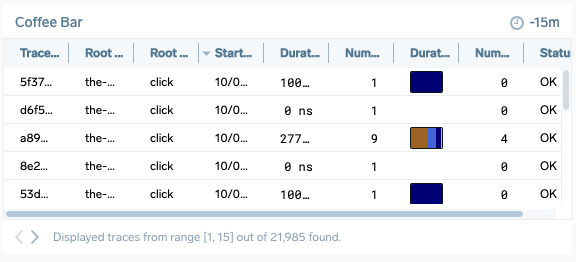
Trace List Panel
Transaction tracing captures and tracks distributed business workflows, by enriching and analyzing traces, logs, and metrics in real-time with automated generated application topology. Each trace provides details on root service, when it occurred and how long, the number of spans, and a breakdown of services. The panel panel displays the Traces page table to give at-a-glance tracking for traces through your Dashboard. To view transaction and service details (Trace View), click a trace from the panel.
See the Dashboard guide for additional information and options to create panels, configure filters, create and filter with template variables from dashboard headers and more.
You are limited to three Trace List panels in a dashboard.
To add a Trace List panel:
- With the Dashboard open, click the Add Panel button.
- A panel configuration page opens.
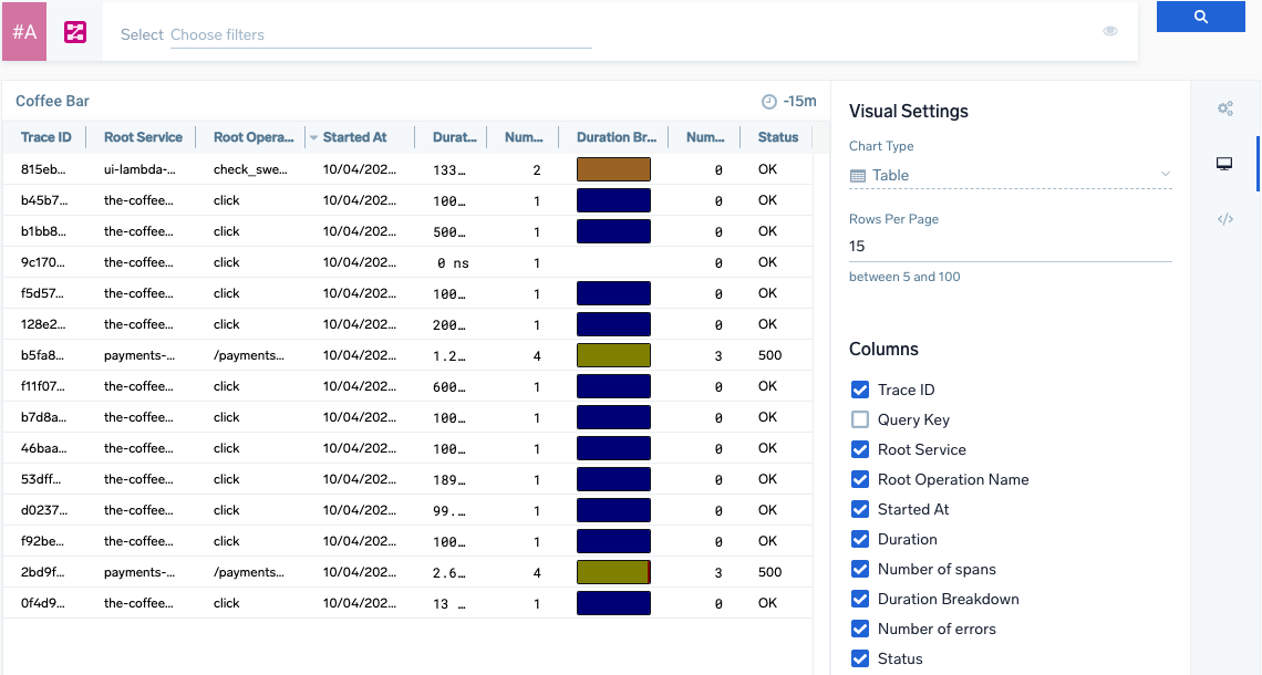
- Configure a Trace query to search for desired set of traces.
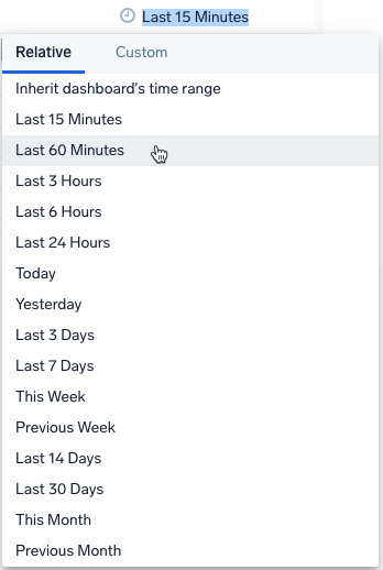
- Select a time range or create a custom range for the panel. You can set this when creating or at any time when viewing the Dashboard panel.
- Select Chart Type as either:
- Table. showing table with traces.
- Breakdown chart. showing aggregated Trace Duration Breakdown Chart.
If you choose Table, complete the following steps:
- Enter the Rows Per Page for the panel, between 5 to 100. The default amount is 15. The panel automatically paginates traces to browse through and view all traces.
- Select the Table columns of trace data to load in the panel:
Column Name Example Value Description Trace ID ffaf2f69ee8ad0c1 The unique identifier of the trace. Root Service api The service that started the trace. Started At 07/27/2020 09:01:04.533 When the trace started. Duration 12.582 ms The amount of time the trace spans. Number of spans 35 A trace consists of spans. This number tells you how many spans are in the trace. Duration Breakdown 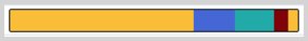
Each color indicates a service. The colors assigned to services are always the same on your account. You can change the color in the span summary tab after clicking on the individual span in trace view.
Hover over to view a percentage breakdown of how long each span covers in the trace.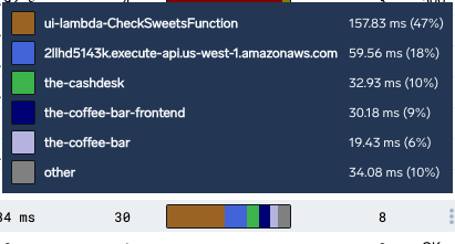
Number of errors 0 The number of errors in the trace. Status 200 The HTTP status code of the trace. - Click the General tab to edit the Panel Details. Enter a name for the panel, set a Title Font Size, and add a short Description.
- Click Add to Dashboard.
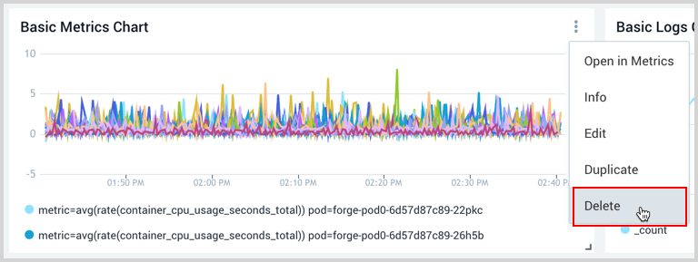
Delete a Panel
You can delete a panel that you no longer need.
- Go to the Dashboard in Sumo Logic that has the panel you want to delete.
- Hover the cursor over the Details icon to display the pop-up menu.
- Select Delete.