Box Plot Charts
A Box Plot Chart graphically depicts groups of data using quartiles, which are the values that divide a list of numbers into quarters. In Box Plot charts, the bottom and top of the box represent the first and third quartiles; the band inside the box represents the median.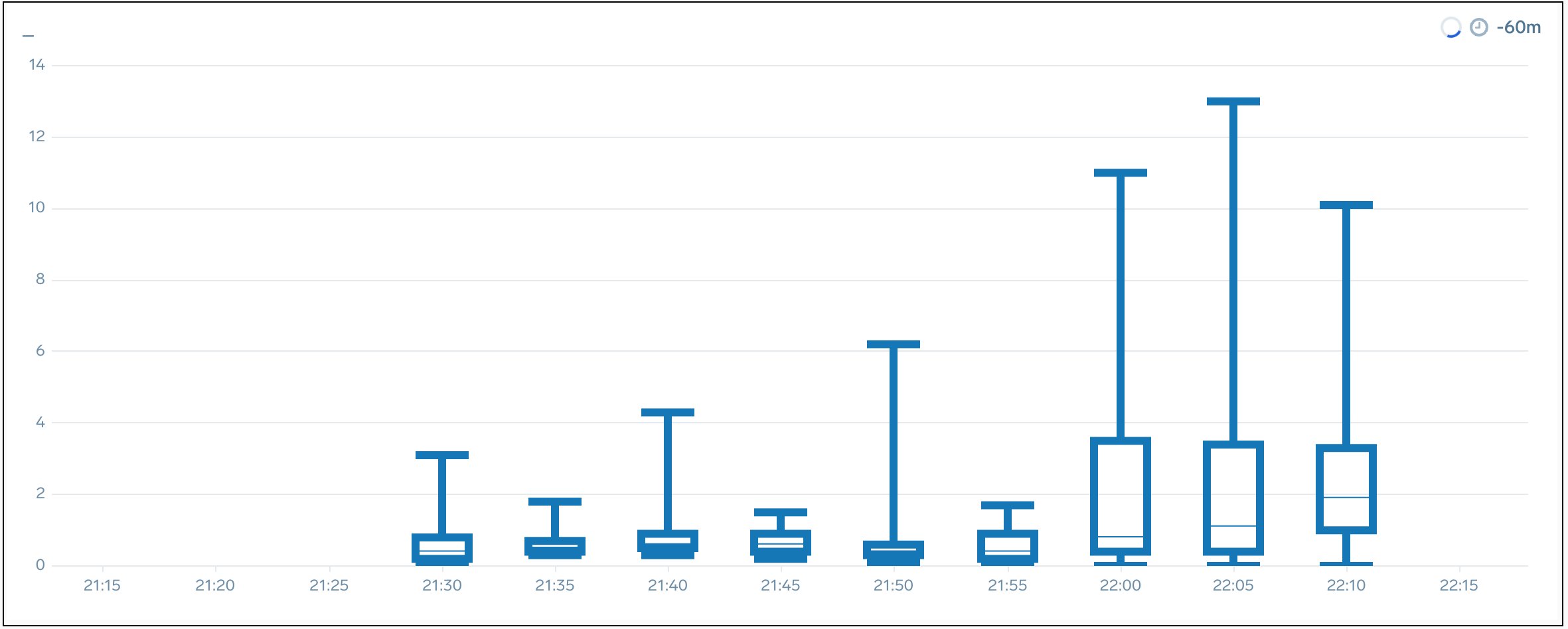
To create Box Plot Chart panels, your query must include:
- Smallest value (sample minimum) using the min or
_minfield name. - Lowest quartile (25%) using the
_pct_25field name. You can use both lower or ends with in this part of the query. - Median quartile (50%) using the
_pct_50field name. You can use both lower or ends with in this part of the query. - Upper quartile (75%) using the
_pct_75field name. - Largest value (sample maximum) using the max or
_maxfield name.
For example, this query can be rendered as a Box Plot Chart:
error | 5 as a | 6 as b | 7 as c | 8 as d | 9 as e | min(a), pct(b,25), pct(c,50), pct(d,75), max(e)
Because this query does not meet all the requirements, it cannot be rendered as a Box Plot Chart:
error | 5 as a | 7 as b | 7 as c | 7 as d | avg(a,b), max(c,d), min(c)
The above query is missing the lower, median, and upper quartile values.
If you query contains more than one of a min, lower quartile, median quartile, upper quartile, or max value, the Box Plot will be rendered using the first value encountered. For example, the box plot rendered for this query would be based on the first min value in the query, min(a).
error | 5 as a | 6 as b | 7 as c | 8 as d | 9 as e | min(a), min (b), pct(b,25), pct(c,50), pct(d,75), max(e)
The Sumo Logic App for Amazon VPC Flow Logs uses a query that creates a Box Plot Chart. It is:
_sourceCategory=vpc
| json "message","logStream","logGroup"
| parse field=message "* * * * * * * * * * * * * *" as version,accountID,interfaceID,src_ip,dest_ip,src_port,dest_port,Protocol,Packets,bytes,StartSample,EndSample,Action,status
| timeslice 1m
| min(Packets), pct(Packets,25), pct(Packets,50), pct(Packets,75), max(Packets) by _timeslice
Create a Box Plot chart:
To add a panel with a box plot chart:
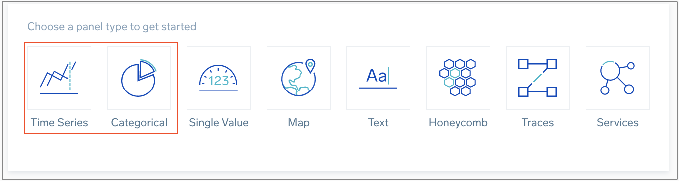
- Create or open a Dashboard and click on Add Panel > Time Series or Add Panel > Categorical.
- Type a supported query in the Search box, including all of the required field names and press Enter for it to run.
- Once the search results appear, select Box Plot from the Chart Type dropdown.
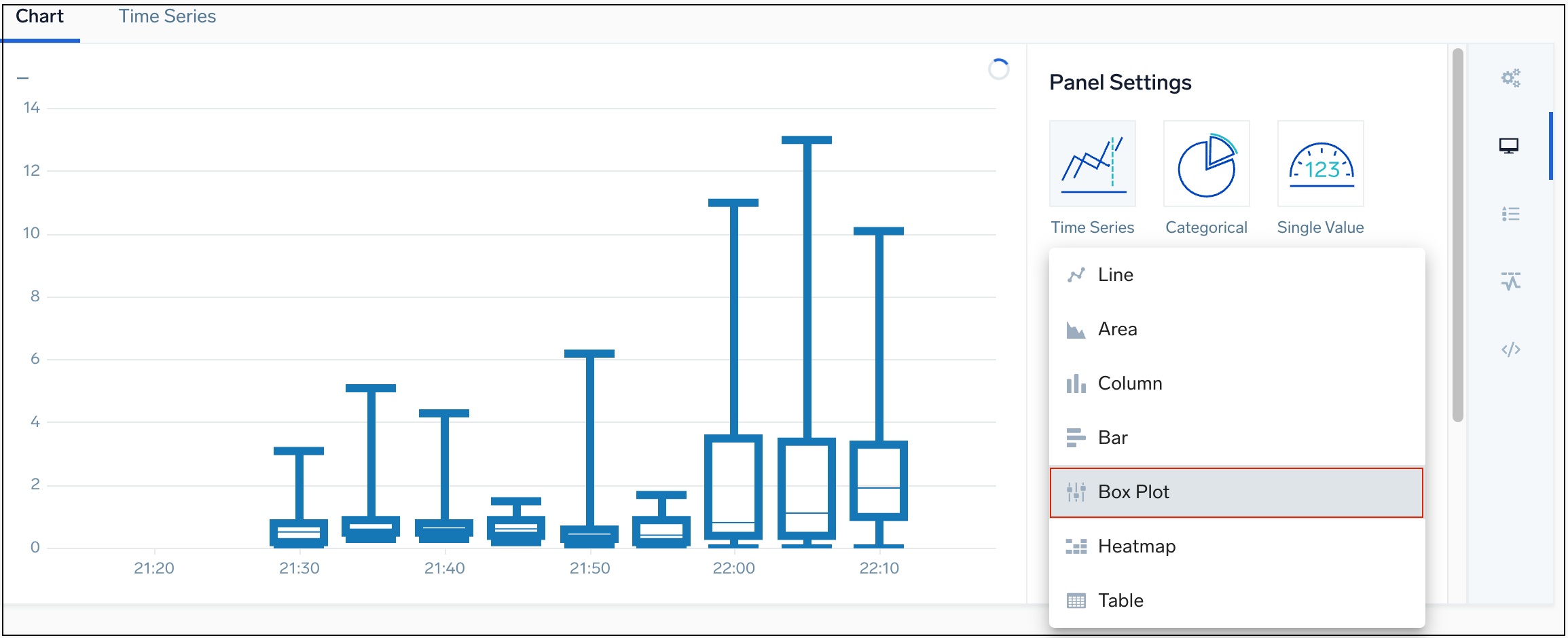
- Modify the chart as desired.