Bubble Charts
Bubble charts are available in the Dashboard platform.
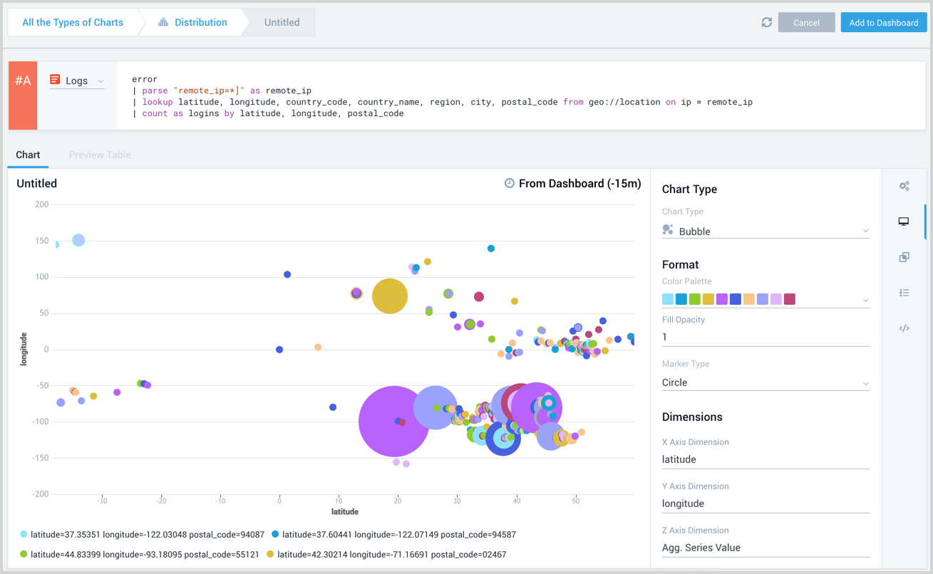
Bubble charts display three dimensions of data. A bubble chart is a two dimensional scatter chart where each data point is represented by its size, the third dimension. This allows you to visualize the counts associated with each point. Bubble charts require at least one aggregate dimension and two other numeric dimensions.
- The X dimension must be numeric and is displayed against the X axis of the bubble chart.
- The Y dimension must be numeric and is displayed against the Y axis of the bubble chart.
- The Z dimension is normally the aggregate field and shows the value of each bubble.
You can modify the fields used for each axis as needed.
For example, in the following query logins is the Z dimension and will be displayed as the value of each bubble. The fields latitude and longitude can be used as dimensions.
_sourceCategory=service "message=User logged in" remote_ip
| parse "[remote_ip=*]" as remote_ip
| lookup latitude, longitude, city, state from geo://location on ip = remote_ip
| count as logins by city, latitude, longitude
Create a bubble chart
To add a panel with a bubble chart:
- Create or open a Dashboard and click on Add Panel > Categorical.
- Enter your aggregate search query in the input field and press Enter for it to run. Only search results that have been aggregated using a group or aggregate operator can be charted. See Group or Aggregate Operators for a list.

- Once the query runs you will need to flip the chart type to Bubble and set your Dimensions. A bubble chart requires three dimensions, including the aggregate.
- Modify the chart as desired.
- Click the Add to Dashboard button on the top right of the window to add the panel to your dashboard.