Column Charts
Column charts are useful for visually comparing the number of events that have occurred, such as the type of error that occurs the most in your system. To create a Column chart, use a search query that provides at least a few data points in the Aggregates tab.
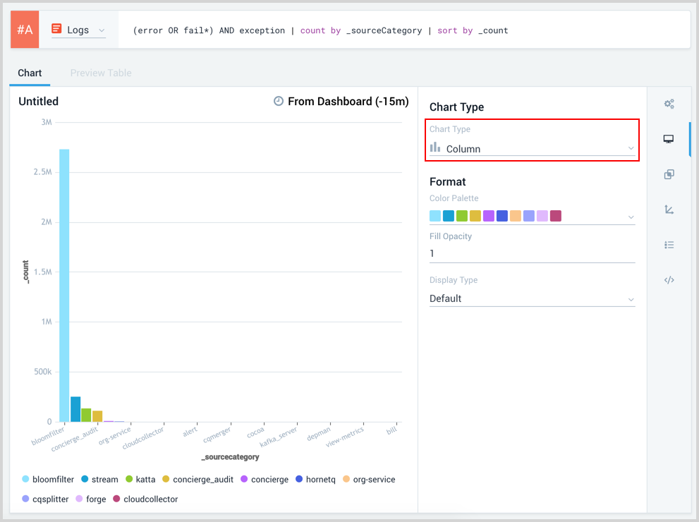
For example, you'd use the following query to create a simple column chart:
(error OR fail*) AND exception | count by _sourceCategory | sort by _count
which would produce results such as: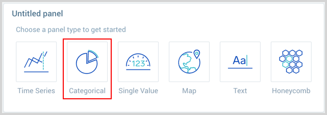
Create a column chart
To add a panel with a column chart:
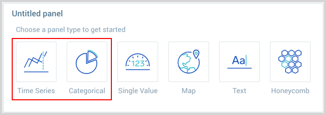
- Create or open a Dashboard and click on Add Panel > Time Series or Add Panel > Categorical.
- Provide a Metric or Log query and press Enter for it to run.
- Once the query runs you will need to flip the chart type to Column.
- Modify the chart as desired.
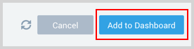
- Click the Add to Dashboard button on the top right of the window to add the panel to your dashboard.
Create a stacked column chart
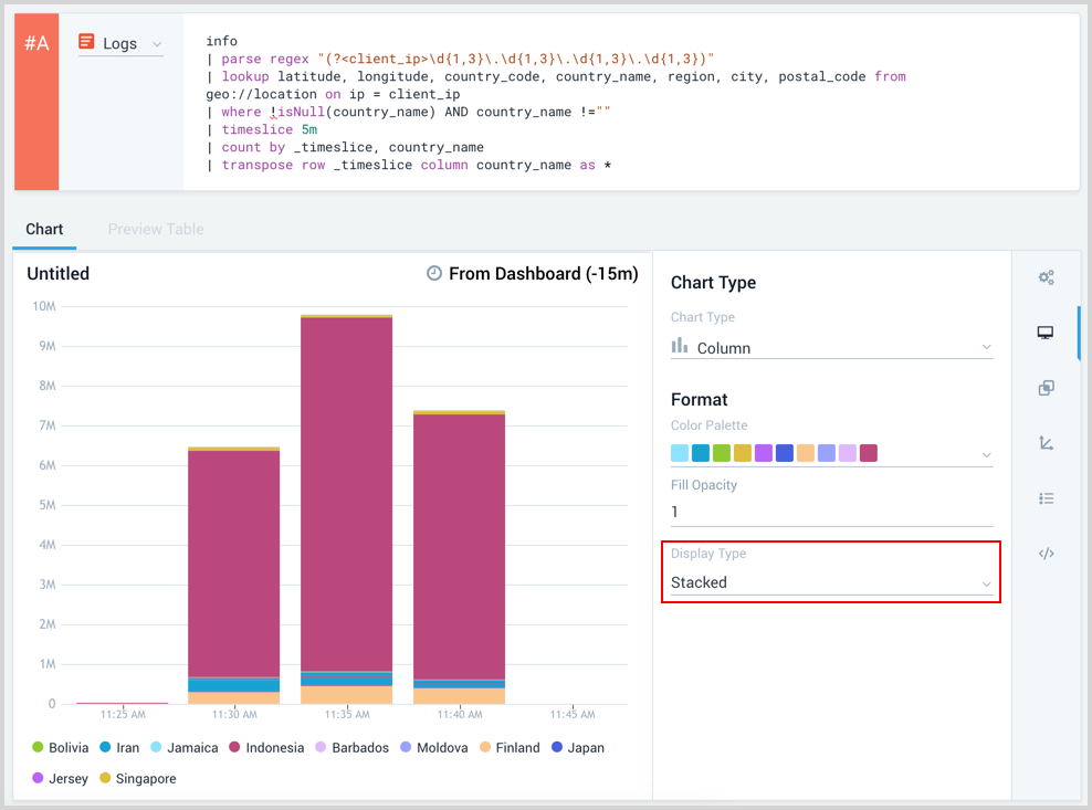
To create a stacked column chart, use a query that uses a multiple series that counts by at least two things, followed by a transpose. For example, this query from the Sumo Logic App for Apache creates a stacked column chart for visits by country over time
_sourceCategory=Apache/Access
| parse regex "(?<client_ip>\d{1,3}\.\d{1,3}\.\d{1,3}\.\d{1,3})"
| lookup latitude, longitude, country_code, country_name, region, city, postal_code from geo://location on ip = client_ip
| where !isNull(country_name) AND country_name !=""
| timeslice 5m
| count by _timeslice, country_name
| transpose row _timeslice column country_name as *
When your query is added to the panel builder press Enter to run it. In the Display options pane select a Stacked Display type.