Combo Charts
Combo charts have a secondary vertical axis allowing you to view two aggregates on the same chart. A common combo chart is a bar or column chart with a secondary vertical axis as a separate line as a comparison.
For example, say we're running a query like:
_sourceCategory=*apache*
| parse "HTTP/1.1\" * * * " as status_code, size, referrer
| timeslice 5m
| avg(size), count by _timeslice
Generally, this query would produce a bar or column chart that looks a bit like this: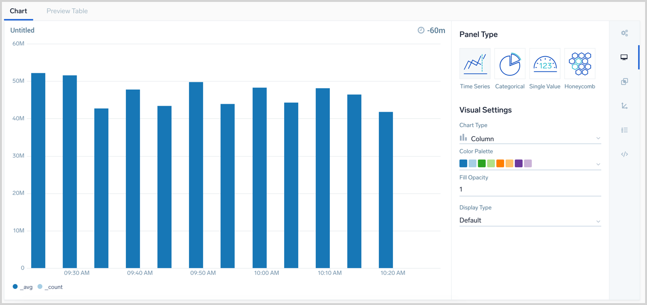
With a combo chart, you can set the _count to display as a line chart on a second Y axis. You will be able to see the number of requests over time from _count, against the average number of bytes per request from _avg.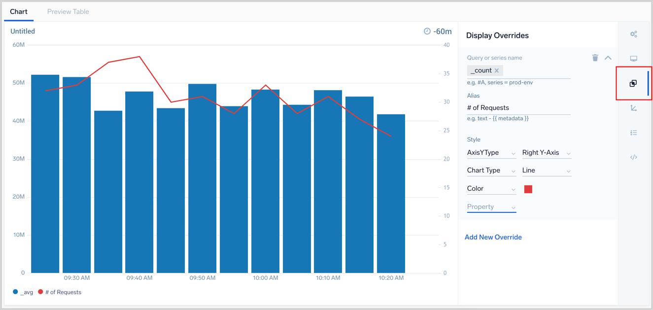
To create a Combo chart, your query needs to return at least two dimensions of aggregate data or time series. Our example is returning _count and _avg.
- Secondary axes are configured in the Display Overrides menu. Open the Display Overrides menu. In the above screenshot, it is surrounded by a red box.
- Select a field or series name to use for the secondary axis from the Query or series name dropdown option. We selected
_countand set an optional Alias. - Under Style is where you tell the panel how to display the data. Select AxisYType and set it to Right Y-Axis. If you select Left Y-Axis it will overlap with the existing aggregate data since it is by default on the left.
- By default, the additional axis will display in the same chart type of the existing data, as set by the Chart Type you selected. In the example above we selected Chart Type and set it to Line so it is easier to visualize.
- Continue to set any other overrides you want and save or update the panel when finished.