Pie Charts
Pie charts are useful for visually comparing the percentage of events that have occurred, such as the type of error that occurs the most in your system. A pie chart will compare different values for the same field. If you want to compare values for different fields consider using a histogram.
To create a pie chart, use an aggregate query that provides at least a few results in the Aggregates tab.
For example, you'd use the following simple query to get results from your logs:
(error OR fail*) AND exception | count by _sourceCategory | sort by _count
which would produce results such as: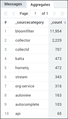
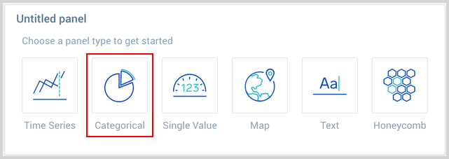
Create a pie chart
- Create or open a Dashboard and click on Add Panel > Categorical.
- Provide a Log or Metric query and press Enter for it to run.
- Once the query runs you will need to flip the chart type to Pie.
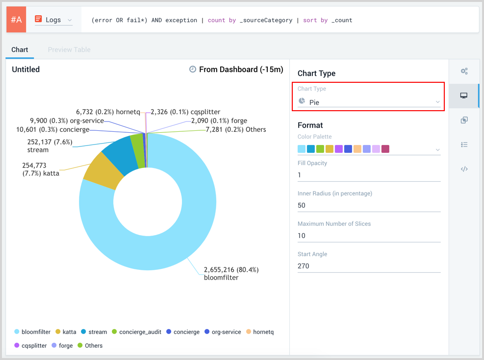
- Modify the chart as desired.
- Click the Add to Dashboard button on the top right of the window to add the panel to your dashboard.