Sankey Charts
Sankey diagram is a type of flow diagram which uses the width of an arrow or stripe to show the proportion of a quantity. In Sumo Logic, Flow Diagrams can represent the flow within a distributed system. For example, you can use the Sankey diagram to see how customers flow through your website via states, which are triggered by log events. These states can show you how long customers take to complete purchases, or even where users are dropping off your site or app.
The Sankey chart works with the transaction operator. When constructing your query, you will define the edges of the chart's lines; Sumo Logic sorts each transaction type into the correct flow line using the states defined in your query.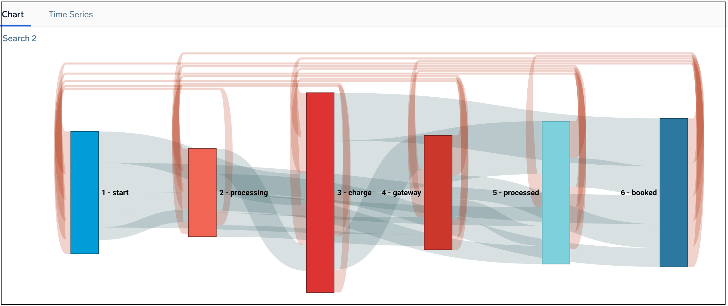
After creating a Flow Diagram, you can hover over any line in the diagram to see additional details between the two states, including loop backs. Additionally, you can click a line to run a drill down search on just that data.
Sankey diagrams are named after Irish Captain Matthew Sankey, an engineer who used this type of diagram in 1898 to show the energy efficiency of a steam engine. (Source: sankey-diagrams.com.)
Create a Sankey chart
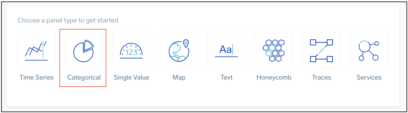
To add a panel with a Sankey chart:
- Create or open a Dashboard and click on Add Panel > Categorical.
- Type a supported query in the Search box, including
fromstateandtostatearguments and press Enter for it to run. - Once the search results appear, select Sankey from the Chart Type dropdown.
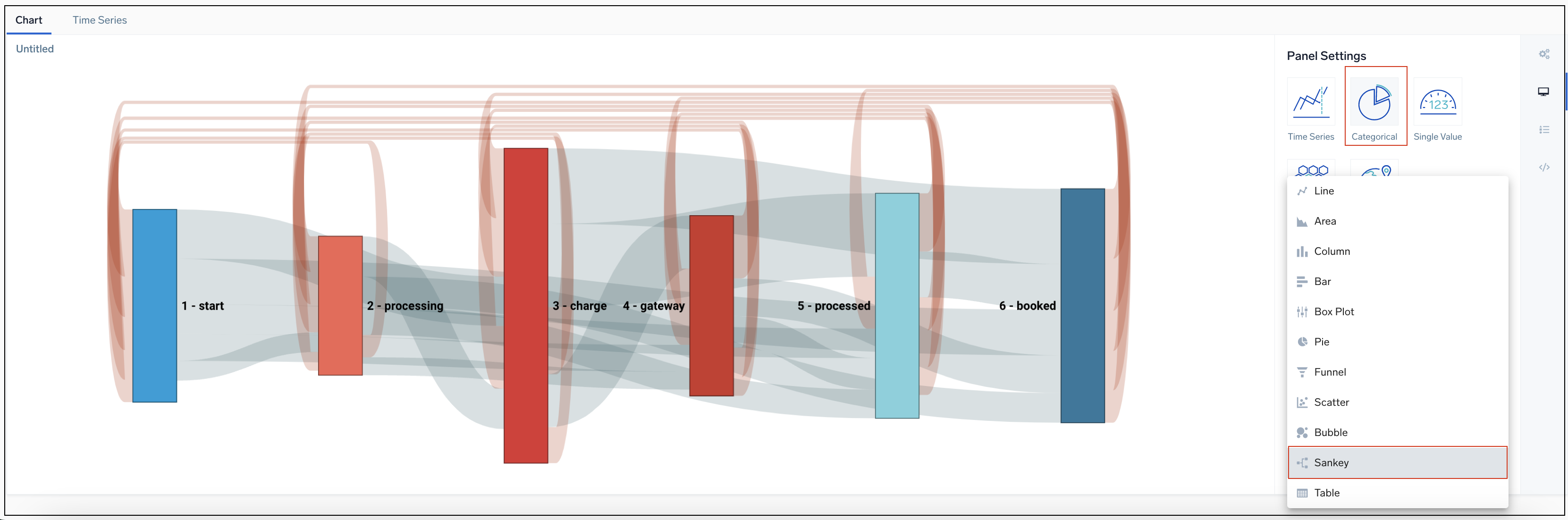
- Modify the chart as desired.
Loop back
Loop backs in the flow (order) of states are tracked and displayed as red lines looping over the respective states in the flow diagram. You can hover over the loops to view the number of occurrences respective states had returned to a previous state.