Scatter Charts
Scatter charts are available in the Dashboard platform.
Scatter charts display two independent numeric fields allowing you to see any correlation between them. You can visually determine how your fields relate to and affect one another.
The aggregate field is displayed as a collection of points. Each point requires two numerical fields for the X and Y axes.
- The X dimension must be numeric and is displayed against the X axis of the scatter chart.
- The Y dimension must be numeric and is displayed against the Y axis of the scatter chart.
You can modify the fields used for each axis as needed.
For example, in the following query logins is the aggregate field and will be displayed as data points. The fields latitude and longitude can be used as dimensions.
_sourceCategory=service "message=User logged in" remote_ip
| parse "[remote_ip=*]" as remote_ip
| lookup latitude, longitude from geo://location on ip = remote_ip
| count as logins by latitude, longitude
Create a scatter chart
To add a panel with a scatter chart:
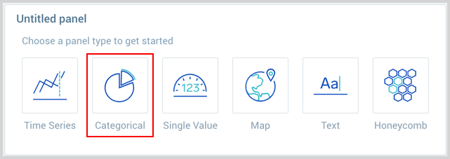
- Create or open a Dashboard and click on Add Panel > Categorical.
- Enter your aggregate search query in the input field and press Enter for it to run. Only search results that have been aggregated using a group or aggregate operator can be charted. See Group or AggregateOperators for a list.

- Once the query runs you will need to flip the chart type to Scatter and set your X and Y Axis Dimensions.
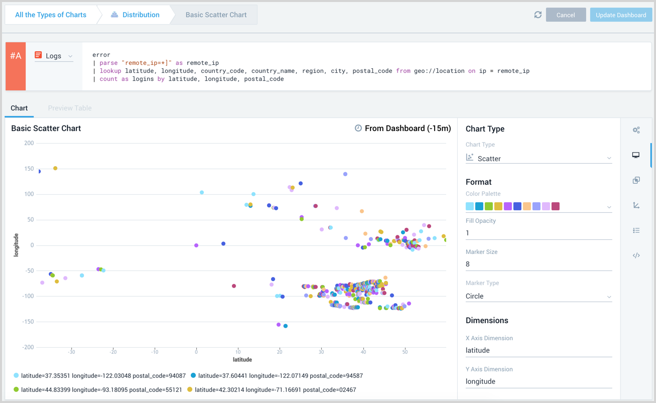
- Modify the chart as desired.
- Click the Add to Dashboard button on the top right of the window to add the panel to your dashboard.