Metric Query Best Practices
There are some common stumbling blocks for creating and charting metric queries in Sumo Logic. In this article we'll cover key metric query best practices, patterns, and tips such as:
- Logs vs metric queries
- Metrics query language tips and techniques
- Quantization and rollups
- Metric discovery
- Chart types, raw vs aggregate, and layout tips
- "ABC" pattern
- Rates and counters
- Data points per minute (DPM)
Logs vs metrics
Although they share a dashboard chart UI, logs and metrics query languages are very different.
| Concept | Logs | Metrics |
|---|---|---|
| Timestamp | Have a _messagetime parsed from the timestamp string and _receipttime (time sent to Sumo Logic). | All metrics have a timestamp of receipt unless it's explicitly stated in the metric format. For example, for Prometheus it can be sent in payload or inferred as "now": http_requests_total{method="post",code="200"} 1027 1395066363000 http_requests_total{method="post",code="200"} 1027 |
| Graphing Over Time | Use timeslice / count + optional transpose operator pattern to convert to charting format over time. Timeslice interval is set in the query. | No _timeslice since all metric data points already have a timeslice called quantization. |
| Aggregation | Specific to the log search query (for example, sum by host vs avg by host), and can have multiple aggregations. | All metrics have multiple rollups stored: sum, min, max, count, latest, _value. By default avg is used and this can have dramatic effects on output of the metric query. |
| Retention | Set at partition level, logs stored immutably until retention is reached, but could be pre-summarized using scheduled views. | Raw metric is retained for 30 days, and a 1-hour rollup for 13 months. For historical 1-hour rollups Sumo Logic calculates the max, min, avg, sum, and count values for a metric per hour. Metrics transformation rules available for custom summarization. |
| Charting | Log search must produce aggregate data in correct format for chart type selected. | Formatting is inferred in charting UI, so in most cases the same query can produce time series or other charts without modification. |
| Cardinality | High cardinality can impact query efficiency but has no impact on log ingest or storage costs. Very high cardinality is supported in log searches (>1m) | Greater cardinality in metric names or tags increases the DPM (data points per minute) and results in higher ingest charges. There are strict cardinality limits and metrics or tags may be disabled if limits are exceeded, for example, max of 5000 series per metric in 24 hours. See High cardinality dimensions are dropped. |
| Query language flexibility | Over 100 log operators allow very complex query types (transactions, log reduce, etc.) and advanced parsing and transformation of fields and values including regex. | Limited metric operators for high performance aggregate charting of lower cardinality data. Parsing and transformation of metric names or values is limited compared to logs. |
| Pricing plan | Either ingest based (ingest cost per GB + storage charge based on retention with free query) or scan based (most cost is generated based on volume of partition data scanned). For ingest based, larger log events (not metadata) drives cost. For scan-based plans, scoping of query, time range, and partition design has greatest impact. | DPM (data points per minute) are averaged over a 24 hour period. Sending more data points by shorter intervals (for example, 10s vs 1m), sending more metric names, or higher cardinality of tags will increase DPM cost. |
Key tips for metric query
Filter metrics
Filter metrics via one or more expression in scope before |. Usually a metric= and one or more tag matches. For example:
cluster=search metric=cpu_idle | avg by node
There are where filter operators, but always filter via scope whenever possible for faster query performance.
Scope wildcards
Scope wildcards are allowed, and matches are case insensitive. For example:
cluster=prod* metric=cpu_idle | avg by node
namespace=*  equates to: namespace tag is present and has any value
Not or !
Use not or !
For example, use !tag=value* or not tag=value* or !(tag=value)
Space
A space implies an AND. The use of AND and OR () is similar to log search. Always bracket () OR for correct scope.
For example,
( host=us* or host=eu* ) AND metric=cpu_idle | max by host
is the same as:
( host=us* or host=eu* ) metric=cpu_idle | max by host
Quantize
Quantize is always applied to metrics (like time slicing in logs). Every metric series has multiple rollup types: min, max, latest, avg, sum and count. Quantize and rollup will have a very large impact on the resulting output. avg is the default.
Pick the correct rollup for the query use case via the quantize operator. For example:
| quantize to 1m using max drop last
Rates
Rates over time display via an ascending counter. Many metric values are ascending counters so you must measure a delta or "rate over time". Use either the delta or rate operators.
Think carefully about the rollup dimension you are using in the output.
The typical pattern is extract rate/ delta then sum in each quantized time range.
The delta operator is easier to understand and graph.
#A #B #C pattern
Use the #A #B #C pattern with the along operator when you need to compute a value from two series. For example:
#A: metric=Net_InBytes account=* | avg by account
#B: metric=Net_OutBytes account=* | avg by account
#C: #B - #A along account
eval
It's often necessary to use math on a metric value via the eval operator. For example:
metric=CPU_Idle | filter max > .3 | eval 100 * (1 - _value) | avg by hostname
parse
The parse operator can extract values from metric names. A common use case is to split metric or tag strings into parts, for example, to remove high cardinality instance or stack IDs. (Use metrics transformation rules for Graphite Carbon type metric strings to turn them into tag and value formats on ingest, or to aggregate metrics to reduce high cardinality tags).
For example, if the load balancer is app/app-song-8d/4567223890123456, the following query:
availabilityZone=us-west-1a metric=HTTPCode_Target_5XX_Count | parse field=LoadBalancer */*/* as type, name, id | sum by name
results in new tags: type = app, name = app-song-8d, id = 4567223890123456
where
The where and older filter operators are best used for value-based filtering, not scope of query. You can use the where operator to filter out either entire time series, or individual data points within a time series. Supported reducer functions are:
avg,min,max,sum,countpct(n)(he nth percentile of the values in the time series)latest(the last data point in the time series)
CloudWatch metrics
The CloudWatch metrics from AWS also sends a statistic tag, so there are multiple versions of each metric sent. You must use statistic=<type> in every query to ensure valid results.
For example:
namespace=aws/applicationelb metric=HTTPCode_ELB_5XX_Count statistic=<type>
This further complicates the quantization type.
Quantization
Quantization is at the very heart of query output for metrics. You must use the correct quantization for every use case.
Every metric series has multiple rollup types: min, max, latest, avg, sum, and count. Every metric query has auto quantize by default using avg, but we override with the quantize operator. The quantize operator has a time window (similar to the timeslice search operator in logs), and a rollup type, for example, avg or sum.
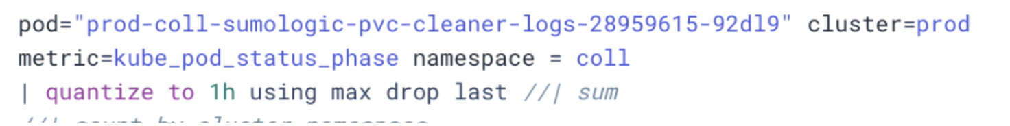
The following screenshot shows a query with the quantize type of max and an interval of 1h:
This screenshot shows the rollup types of min, max, latest, avg, sum, and count:
Pod count quantize example
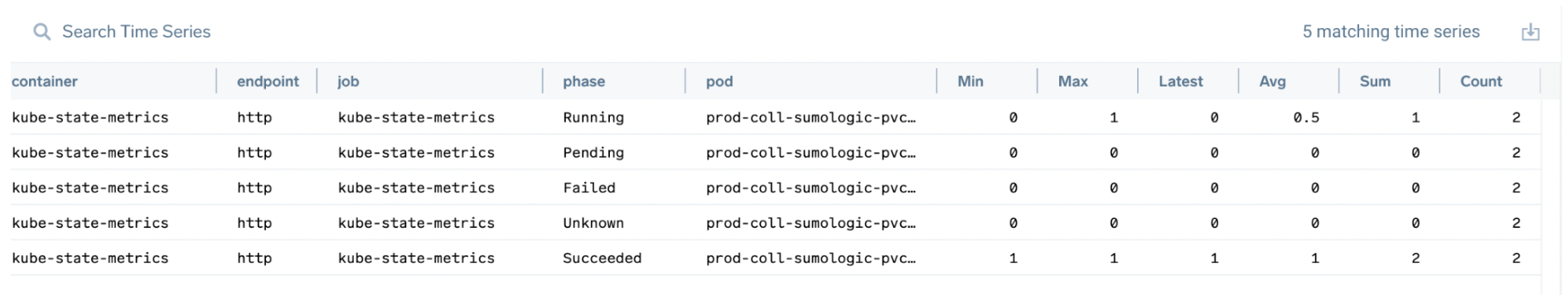
Suppose you want to find the latest value for total pods in a cluster regardless of the run state. Each pod has 5 metric series (one for each possible pod state tag) with a value from 0 to n being the number of pods in that state:
Note that when you sum the columns, the sum of max is 2, sum of avg would be 1.5, and the sum of count would be 10.
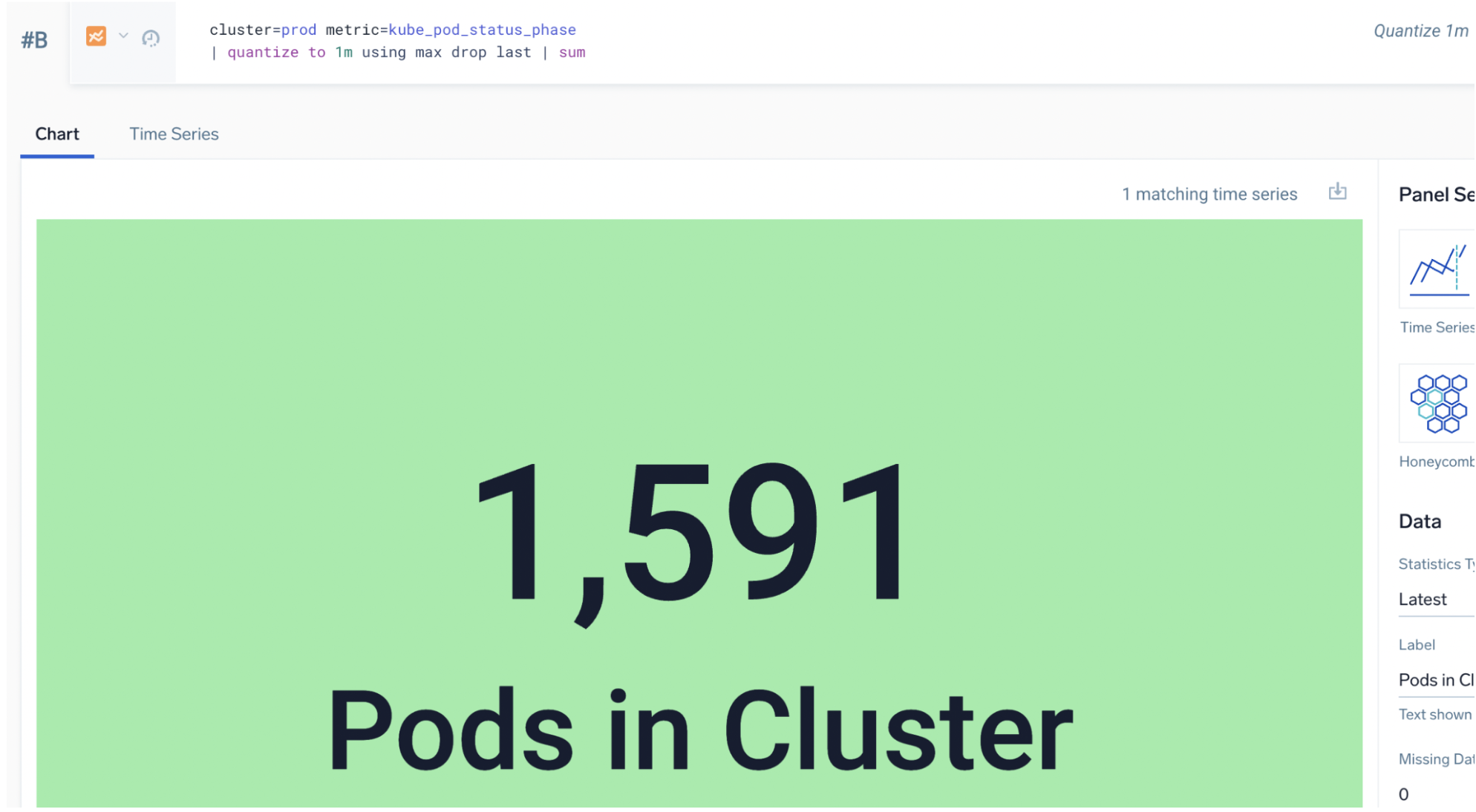
The correct query is to max each series and then sum them:
cluster=prod metric=kube_pod_status_phase
| quantize to 1m using max drop last | sum
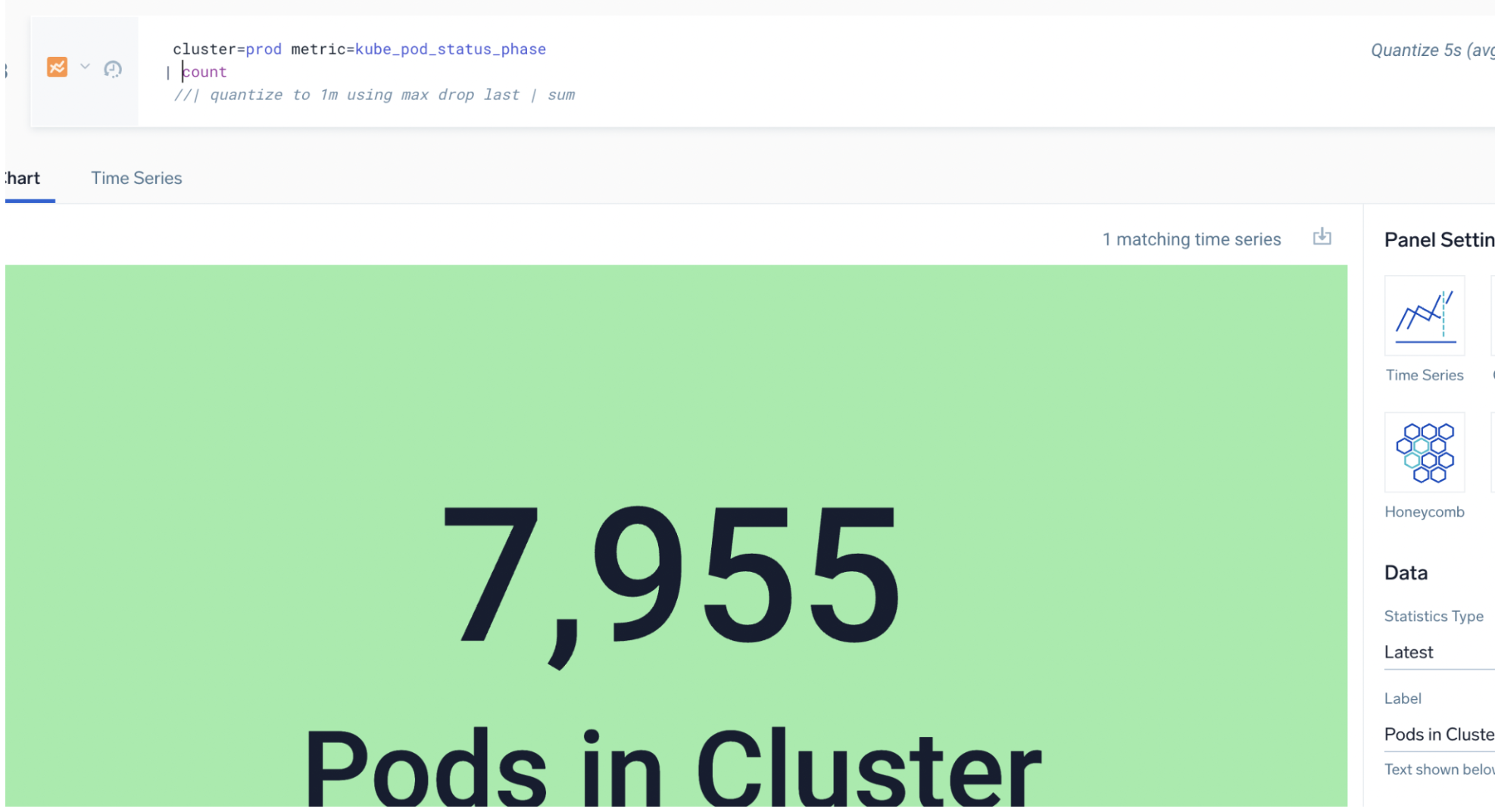
The wrong approach is to average the rollup and count of metric series:
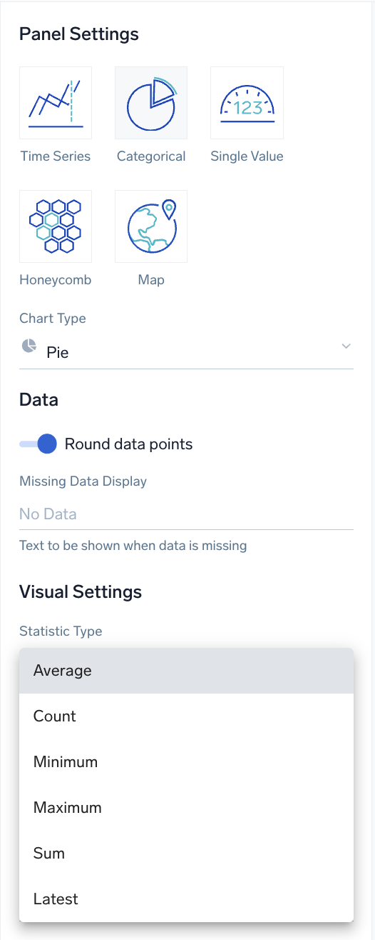
Changing statistic type on a chart changes results
Changing the Statistic Type on a chart (if that option is present) changes the output of the query that is displayed. Always consider if the default of Average is correct:
For example, selecting the Average statistic type for the following query yields a sum of 75.63: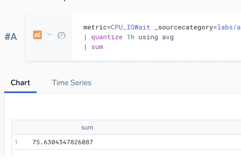
But selecting the Sum statistic type for the same query yields a sum of 1,739.5: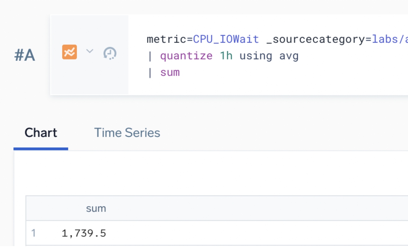
Metric discovery
Autocomplete
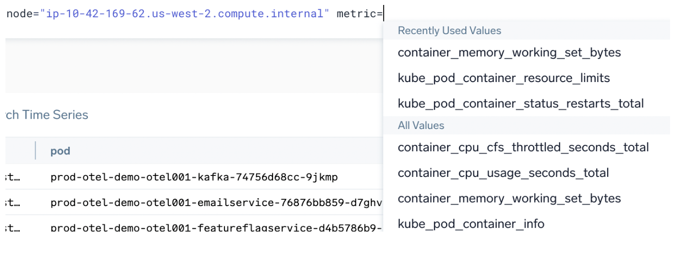
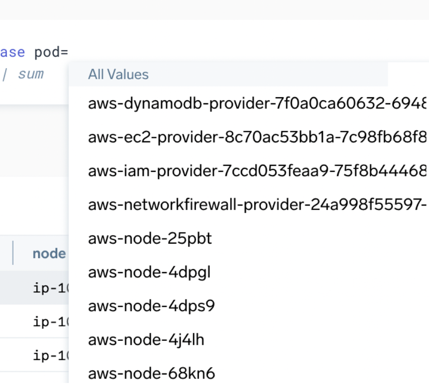
Metric and tag discovery is a key activity in creating metric queries. Metrics Search provides an autocomplete function to make it fast and easy to build out metric queries. Tag names and values are supplied in the query UI based on the current metric query scope.
Autocomplete can show you:
- Which metrics exist for a specific scope:
- What tag names exist for a specific metric or tag scope:
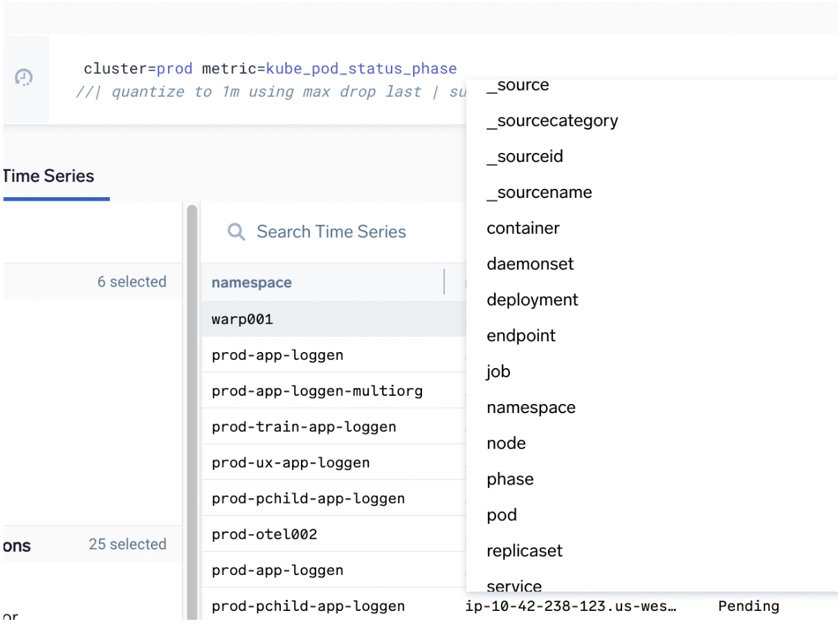
- What values exist for a specific tag in the current scope:
Time series
The Time Series view lets you review the metric time series and tag values when the query outputs raw metric query (with no aggregation). Use this view to understand what many metric series are in the current scope and check how many values appear in tag columns or understand higher than expected cardinality values in tags.
Switch to the Time Series tab to see metrics, tags and tag values:
- Use
//to comment out the aggregate part of query to jump back to raw time series view. - Columns are sortable.
- Select the ellipsis button on any tag value in the grid to quickly add filter statements.
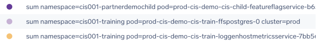
Time series example
In the following example, we use the comment tag // to view the metric query that is still raw (no aggregation) in the Time Series tab:
container="istio-proxy" node="ip-10-42-169-62.us-west-2.compute.internal" metric=container_memory_working_set_bytes cluster=prod namespace=prod-otel001
| quantize 1m  // | avg by container, pod | sum by pod
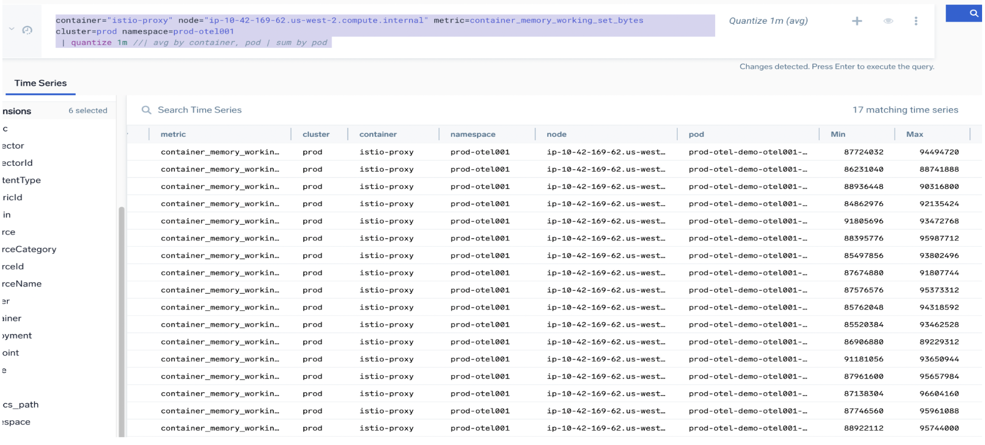
Notice the following:
- The
container,namespace, andpodlabels for the metric from Kubernetes (https://kubernetes.io/docs/reference/instrumentation/metrics/). - There is one metric in scope for
clusterandnode. - There are 17 time series, so one or more tags must have unique values.
- The
deploymentandpodcolumns both have 17 values (one per istio endpoint). - Use
avgquantization (default), thensumfor final total. - Don't use
sum(total for all data points) orcount(count of data points only).
Charting metrics
Metric chart types
Unlike log searches, you often don't need to format the query output to make different types or charts. Some panels like Single Value do need aggregate output formatted a certain way.
For metrics, the UI has a very large impact on the resulting chart (compared to log search charting). The same query can produce many types of charts even when not aggregated (unlike in logs).
Aggregate in metrics
Good reasons to aggregate in metrics:
- Better control over resulting time series from query.
- Much easier to get the query output you want to chart.
- Queries will scale to larger numbers of series and data points.
For a single metrics query row, Sumo Logic limits the number of input time series to 1000 for non-aggregate queries. For aggregate queries (queries that have an aggregate operator likeavgormax) the limit is at least 200,000 for time ranges within last 24 hours and 50,000 otherwise. - For monitors it makes it easy to have alert grouping, for example, per cluster, per pod, per host.
- In monitor payloads you can use
ResultsJson.<fieldname>for custom alert text.
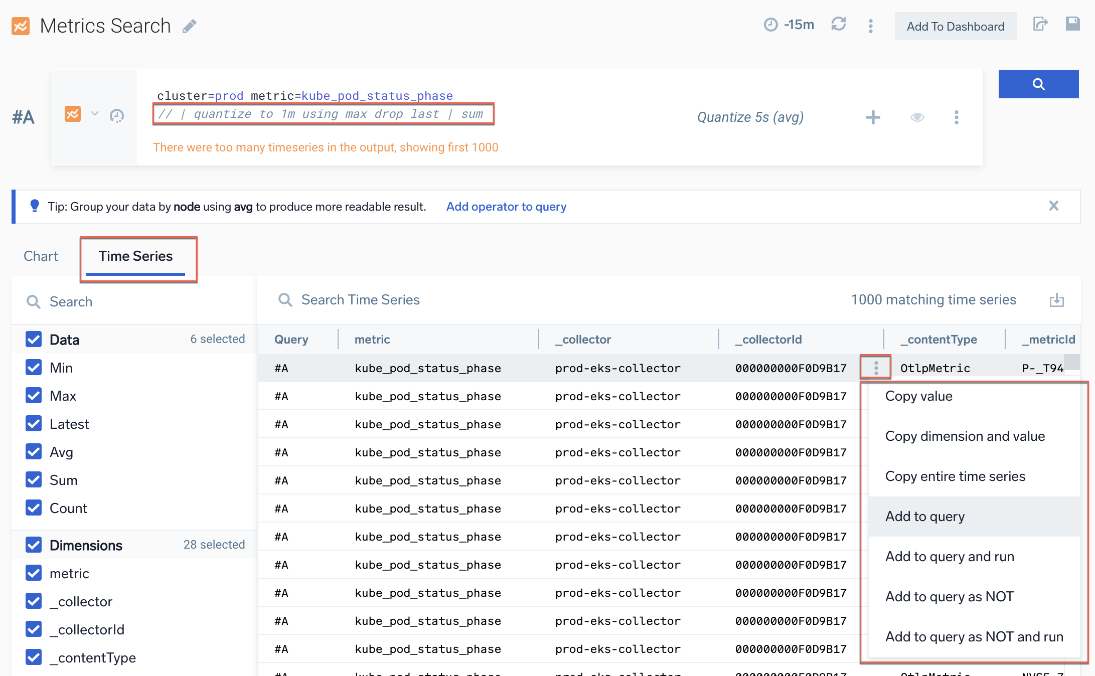
Fix "too many timeseries in the output"
When you perform a metric query, you may see the following message:
There were too many timeseries in the output, showing first 1000.
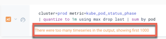
You can't have more than 1000 groups in aggregation or raw data series. This is called the "output limit". For more information, see Output data limit.
Try the following fixes:
- Perform a final aggregation by a dimension with less than 1000 groups:
| sum by pod | sum
or| sum by namespace - Use the
topksearch operator:| topk(500,latest)| sum by pod - Filter to remove series using
filterorwhereoperators:| filter max > 0
or| where _value > 0
or| where max > 0
Metric charting options that change output
Pay special attention to these UI options as they can impact your metrics chart output much more than log search does:
- Rounding
- Statistic type, especially for raw query
- Stacking for some types:
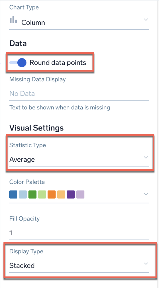
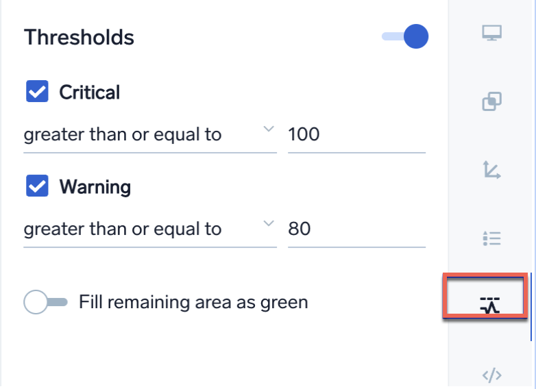
- Group or sort can be a UI setting in some charts:

- Threshold chart coloring can be a UI setting:
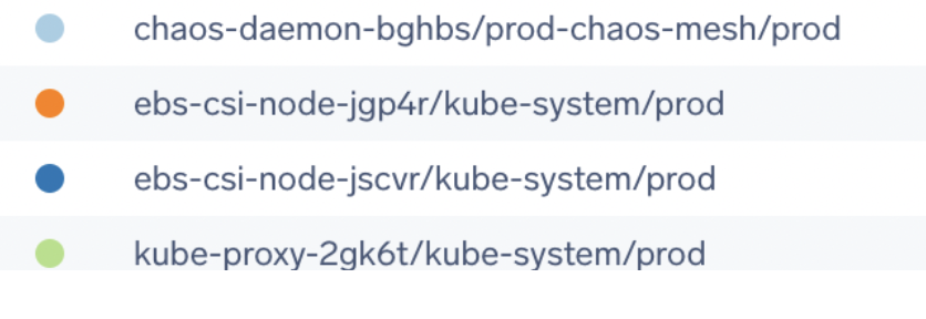
Overrides to improve series naming
Use the Display Overrides tab to make it easy to read alias for metric series names in legends and popups, as well as the more usual options for custom chart formatting, such as the left/right axis. For more information, see Override dashboard displays.
Following are examples of queries with and without override.
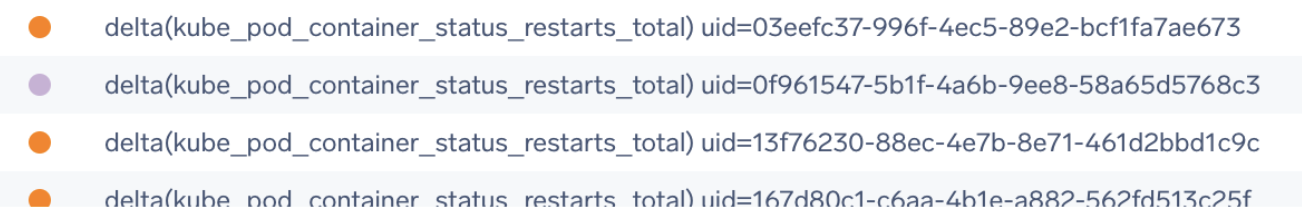
Default raw series
Query:
metric=kube_pod_container_status_restarts_total
| quantize using max | delta counter
| topk(100,max)
Override: None
Output:
Aggregated
Query:
metric=kube_pod_container_status_restarts_total
| quantize using max | delta counter
| topk(100,max) | sum by pod,cluster,namespace
Override: None
Output:
Aggregated with override alias on #A
Now see how an override makes it easier to read output.
Query:
metric=kube_pod_container_status_restarts_total
| quantize using max | delta counter
| topk(100,max)
| sum by pod,cluster,namespace
Override:
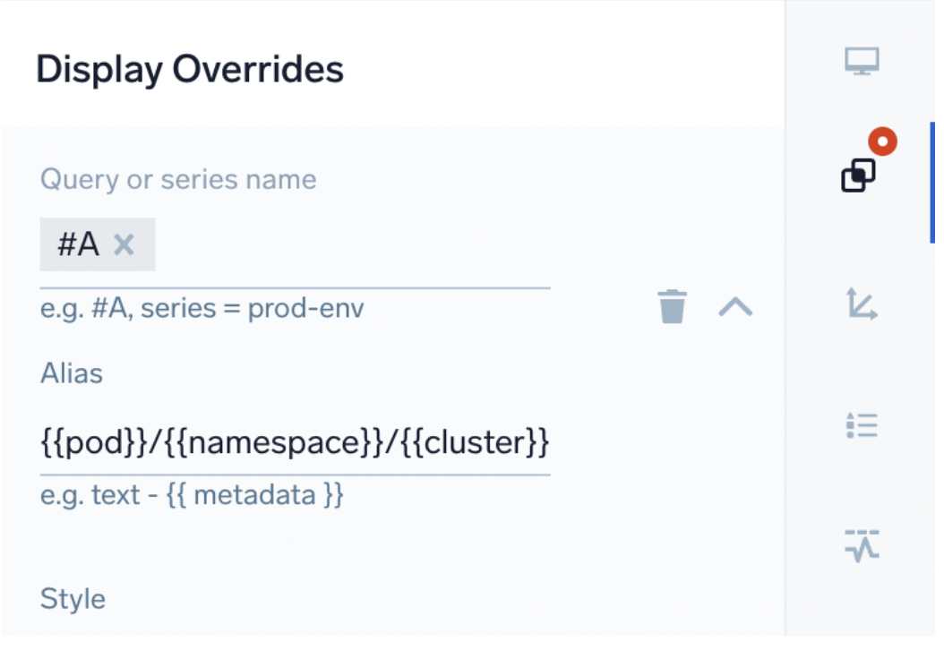
Output:
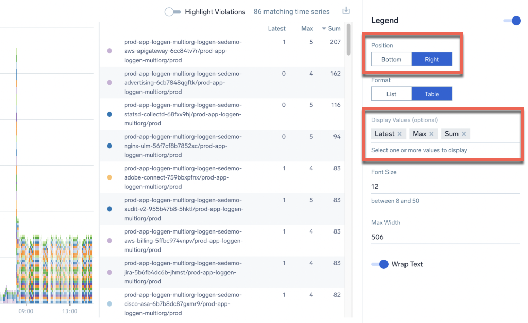
Tabular stats for time series panels
Use the Bottom or Right positions with table format and include aggregates like sum, avg, and latest to enable summary stats in the same panel for time series charts.
Learn your ABC
ABC pattern
To compute a third series C from two series A & B is the ABC pattern. Common examples are:
- % usage where CPU, memory, or disk full % where metrics capacity and and usage are sent separately.
- Determine usage in Kubernetes metrics sent as multiple series such as requests versus limits for pods.
When using the ABC pattern, keep in mind:
- If this is
per xit must be grouped correctly, for example,sum by pod. Take careful note of quantization period and type. - Create a #C series with required computation.
- Make sure the quantization period is identical for all three series, or results will be very strange.
- If grouping, you must include
alongin #C. For an example, see Join Metrics Queries.
ABC example 1 - Disk usage % top 20
Say we have two metrics and want to calculate a usage % for the top 20 fullest disk volumes:
// metric gives us bytes size per node, mount, device
node="ip-10-42-177-158.us-west-2.compute.internal" cluster=prod metric=node_filesystem_size_bytes !fstype=tmpfs node=*
| quantize to 5m using avg
| avg by node,mountpoint,device
// gives use the free bytes per node,mountpoint,device
node="ip-10-42-177-158.us-west-2.compute.internal" cluster=prod metric=node_filesystem_avail_bytes  !fstype=tmpfs node=*
| quantize to 5m using avg
| avg by node,mountpoint,device
Create an #A and #B series with the queries above and then add a #C series:
1 - (#B / #A) along node,mountpoint,device | eval _value * 100 | quantize to 5m using avg
| topk(20, latest)
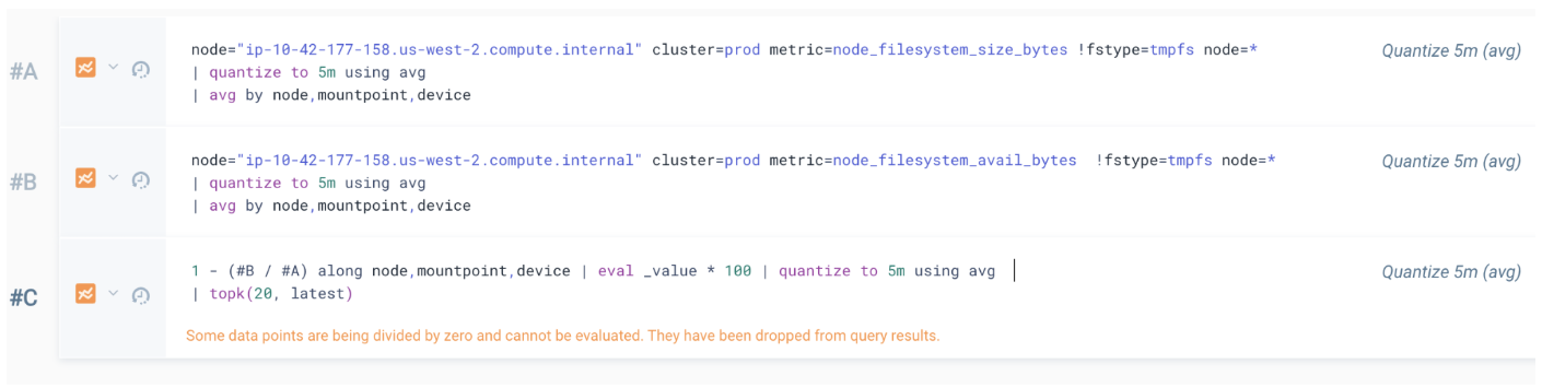
For our top list output we've chosen a bar chart, with only #C visible, with sort by value descending, and latest value shown. Note that along is very important: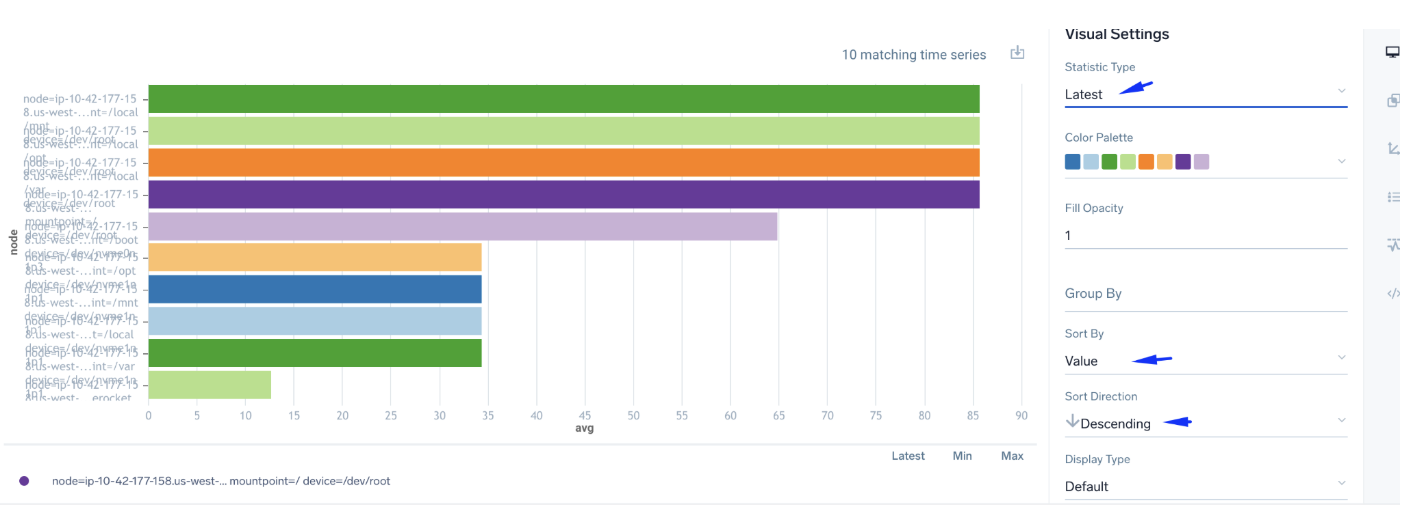
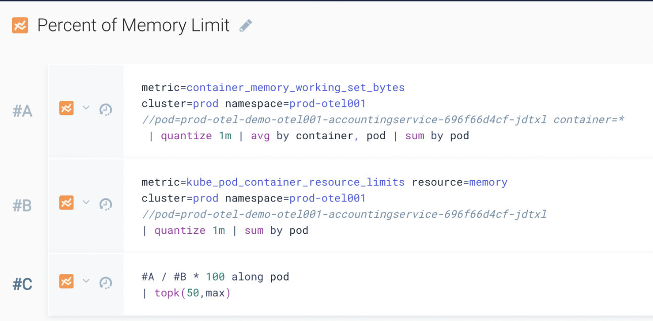
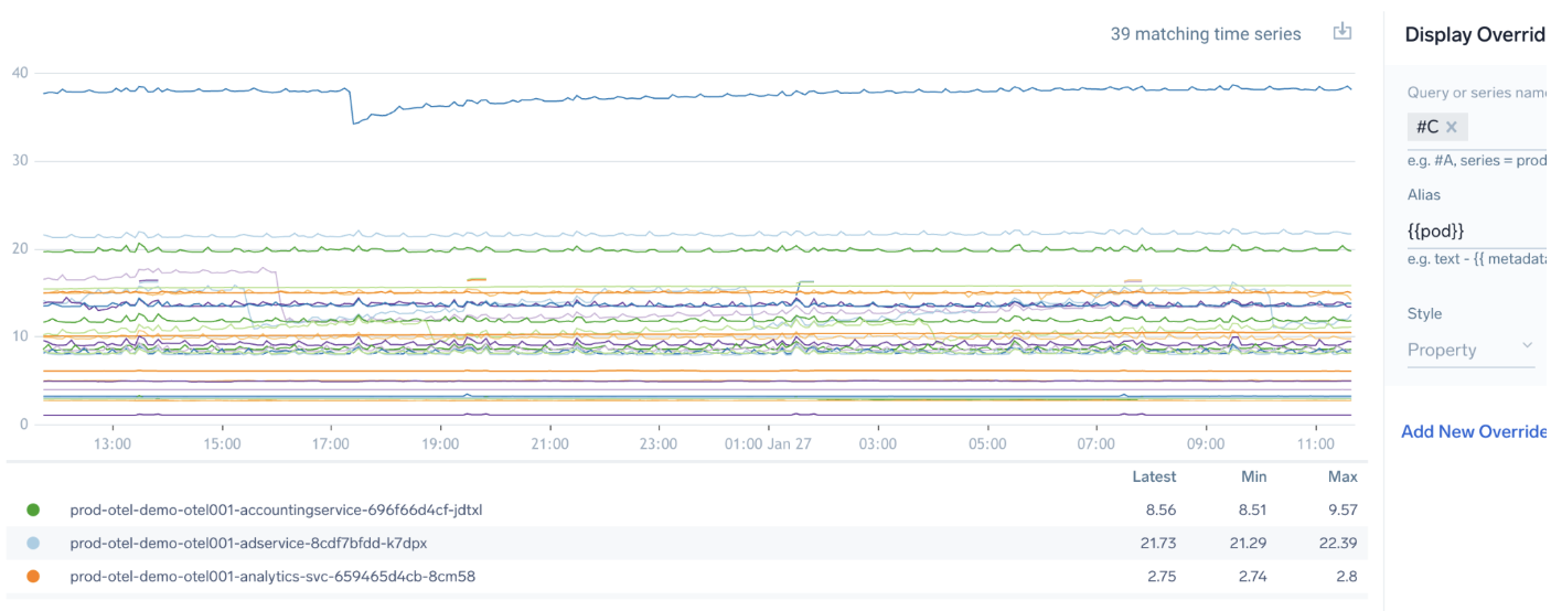
ABC example 2 - Kubernetes memory versus limits by pod
A query:
metric=container_memory_working_set_bytes
cluster=prod namespace=prod-otel001
 | quantize 1m | avg by container, pod | sum by pod
B query:
metric=kube_pod_container_resource_limits resource=memory
cluster=prod namespace=prod-otel001
| quantize 1m | sum by pod
C query:
#A / #B * 100 along pod
| topk(50,max)
Rates and counters
Many metric values are sent as a cumulative counter, for example, kube_pod_container_status_restarts_total, or need to be graphed as a rate over time such as requests/sec.
To graph, typically we want to calculate the rate of change and sum that in each time window using one of various possible syntaxes. A delta operator often simplest to use, but there are lots of options for similar results:
- Use
quantizeto calculate rates/time:| quantize using rate - Use
deltafor increasing counters, for example, total restarts:| delta counter - Use
ratefor increasing counter rate/time:| rate increasing over 1m. - Use
sumto turn value over X bucket into rate/time:| sum | eval 1000 * _value / _granularity
Counter example
Following is a counter example showing pod restarts using the kube_pod_container_status_restarts_total metric:
metric=kube_pod_container_status_restarts_total
| quantize using max | delta counter
| topk(100,max)
| sum by pod
Note that:
quantizeusingmaxnotavg(default), or you will get odd fractional results.deltais the easiest operator to measure counter change.ratewill produce fractions not integer.sumthe delta of the max rollup, and use a stacked bar for an insightful view.
Following is the correct way to structure your query to show pod restarts. Use max with quantize, the delta operator in counter mode, and topk to show only 100 most restarts. The stacked chart clearly shows the restart rate by pod.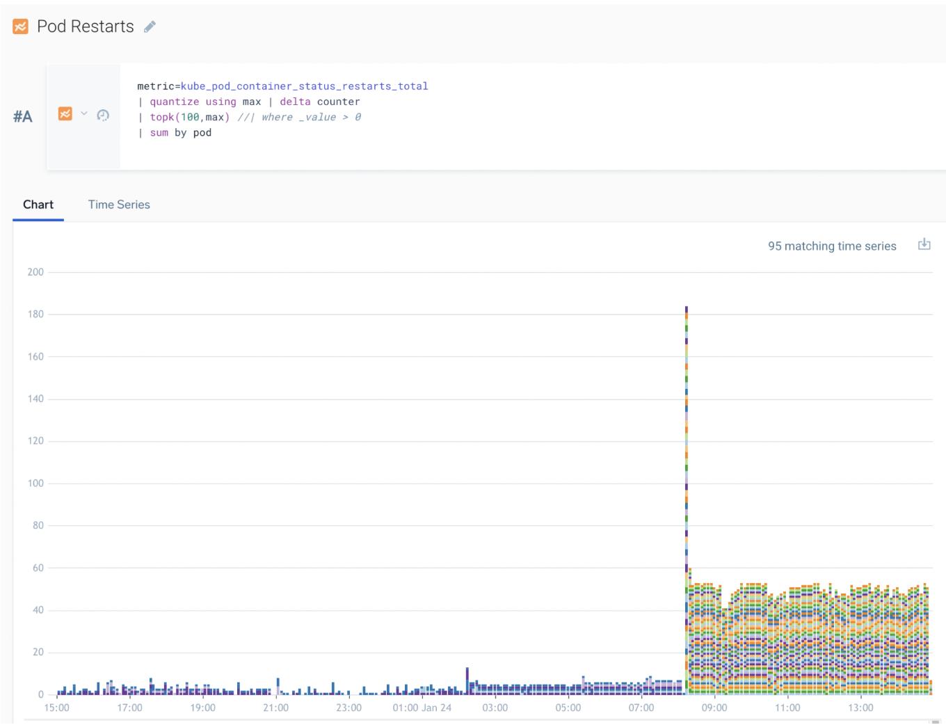
Following is an incorrect way to query for pod restarts. It uses sum over time for the cumulative total of restarts per container.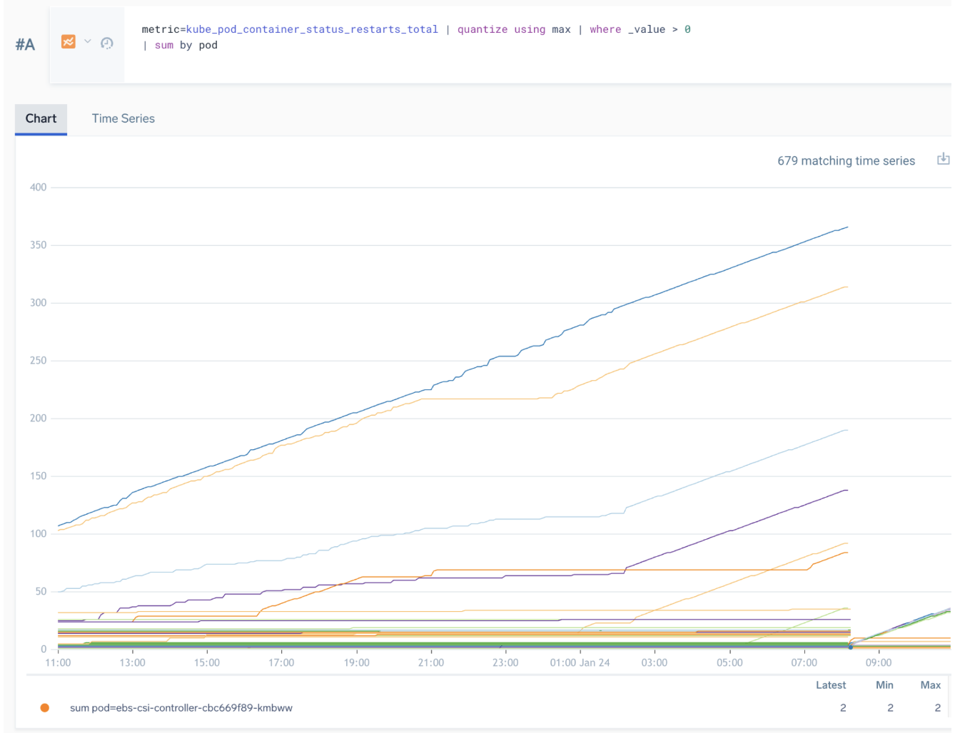
Managing DPM and high cardinality
Understanding DPM drivers
Metrics are billed in data points per minute (DPM), typically at a rate of 3 credits per 1000 DPM averaged over each 24 hour period. DPM = metrics * entities * total cardinality of all tag names/values, so sending more metric/tag combinations increases cost.
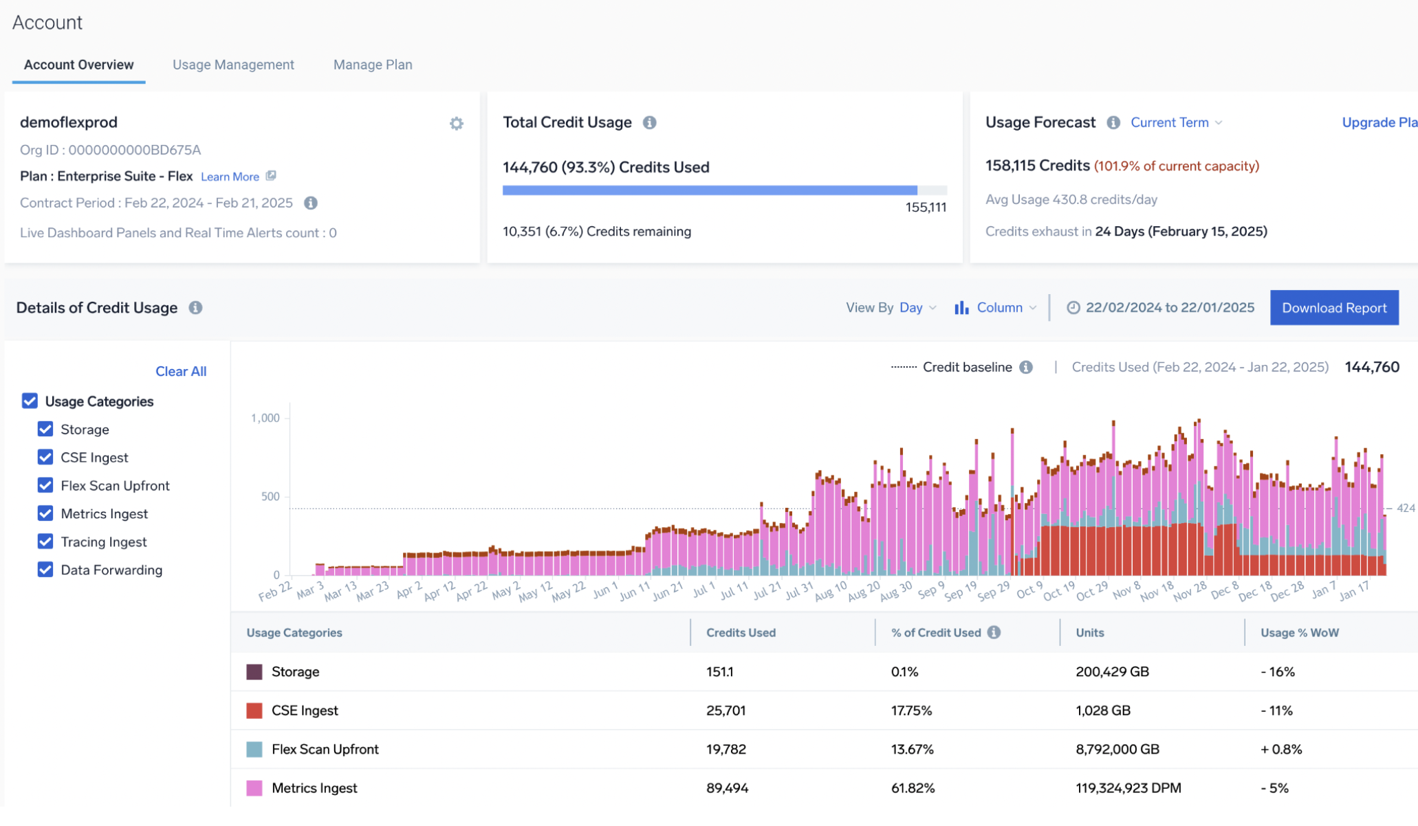
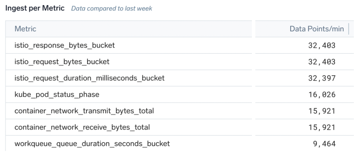
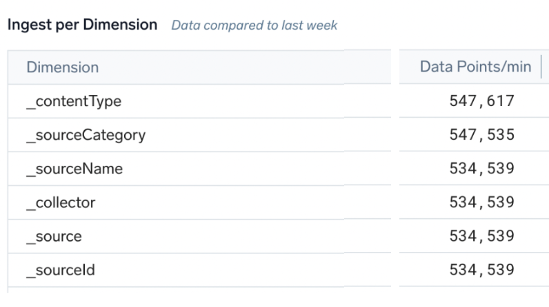
We have three tools in Sumo Logic to track DPM usage and drill down into drivers of high metric cardinality:
- The account page shows metric consumption per day over time:
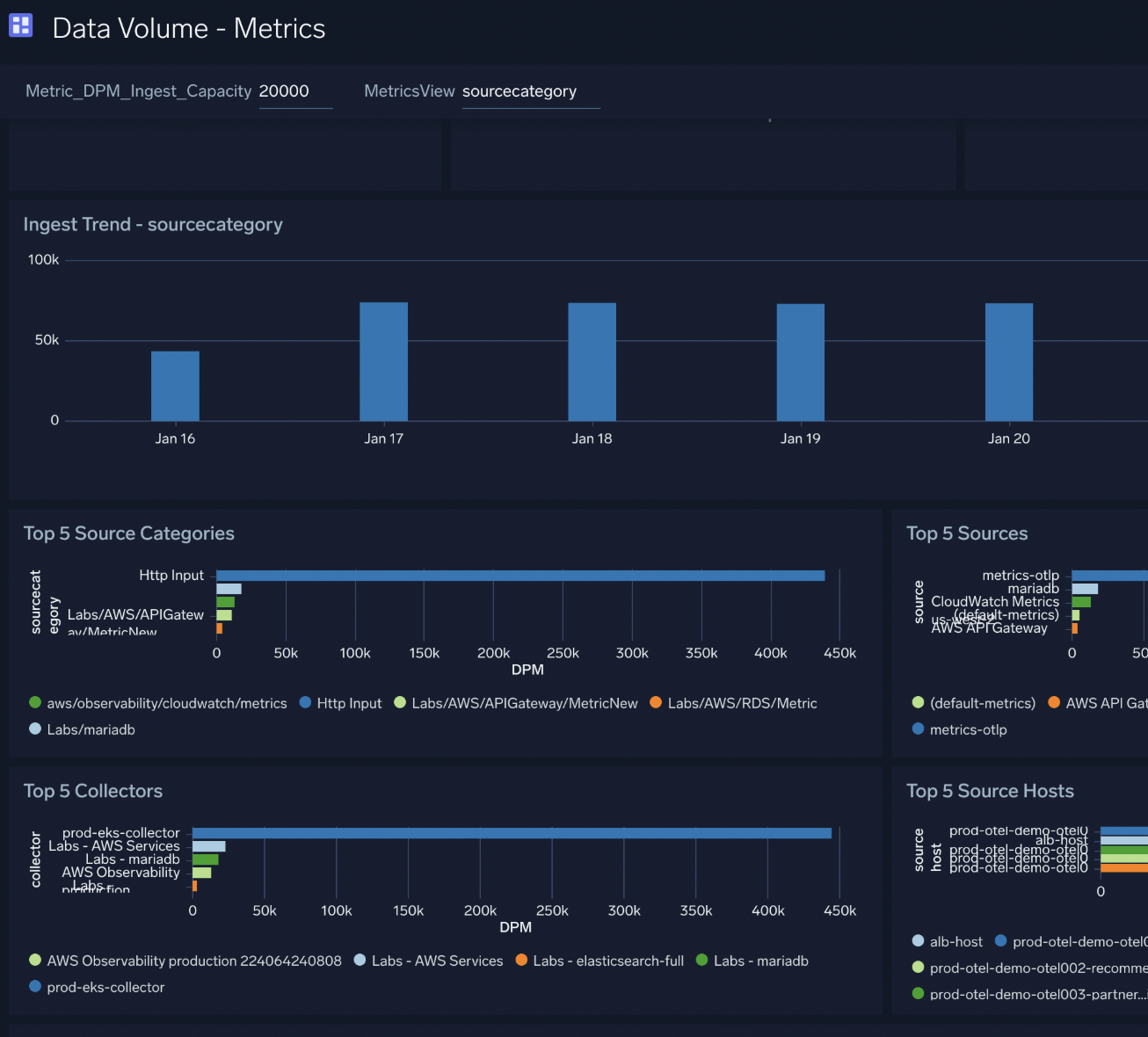
- The Metrics dashboard in the Data Volume app can track high DPM consumption per metadata fields such as
collector,source, andsourcecategory: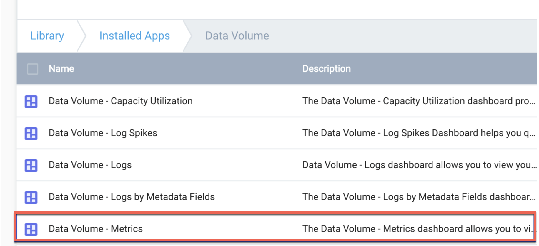
- Metrics Data Ingestion is a filterable admin UI to show detailed DPM and cardinality per metric name or tag. Advanced users can make custom log searches versus the underlying audit indexes for this source.
Metric DPM versus credits
More data points require more credits, and therefore, more cost.
Key factors that result in higher DPM are:
- Number of hosts, sources, or entities
- Increase in cardinality
- Increase in number of metrics
- Frequency of data points
Excessively high cardinality for a metric or single tag might trigger rate limiting or blocking of that metric. See Disabled Metrics Sources.
Number of hosts, sources, or entities
Having more of something sending metrics means more DPM. For example, ff you sent 50 metrics per host and have 1000 hosts, that will be 50,000 DPM.
In some use cases you can filter out unwanted hosts. For example, you could filter by Kubernetes namespace or AWS tag to reduce the total number of metric entities.
Increase in cardinality
Sending dimension (tag) values for metrics with high cardinality will result in high data points per minute for that metric. Also high cardinality can make analyzing and interpreting metrics difficult.
The cardinality (and hence DPM) of a single metric is the product of all possible cardinalities of tags. For example:
- host x10 and service x20 = up to 200 DPM
- host x10 and service x20 and url_path x 5000 = up to 10,000 DPM
- host x10 and service x20 and thread_id x1000s and customer id and x2M customers = millions (very likely to get rate limited)
- host x10 and service x20 and epoc nano sec
1737579476122= every data point becomes a unique time series producing millions (very likely to get rate limited)
Ideally, tag value cardinality should be low (less than 100). If you need very high cardinality, logs are usually a better option. Log query engine is much more flexible and can handle very high cardinality by design.
Never send high cardinality tag values where it's likely to have more than a few 1000 values per tag such as:
- Timestamps or epoch times
- User or customer IDs or usernames (where there could be more than 50k possible values, possibly millions)
- Query string, for example, on a search form where any search text is a tag
URL or paths with high cardinality such as unique per customer URLs (for example,
http://foo.bar/473639029/account
At best, metrics with 10k of tag values will be expensive to ingest and hard to query, and at worst, they will be blocked.
Increase in number of metrics
If you see an increase in the number of metric series, look for new metric sources onboarded and consider filtering the metrics sent. Most metrics pipelines offer configuration options to filter the metrics sent. For example, open source metrics systems like Telegraf offer plugin configuration to include or exclude metrics rather than send all of them, for example:
- Metrics filtering in a Kubernetes collection
- Using Telegraf filtering such as
fieldpassto send only valuable metrics, not all metrics in the plugin (default).
Frequency of data points
Sending one data point per minute will make one DPM per entity x tag cardinality. But sending four data points per minute (every 15s) will make four DPM per entity x tag cardinality. Check the default frequency of metric sources and reduce the frequency to reduce DPM.
A common use case is reducing scape interval so 1m or 2m in Kubernetes collection. Steps for Kubernetes collection v4 (OpenTelemetry) and v3 (Prometheus) can be found here.