Application Service APM/Tracing Dashboards
To access APM hierarchies:
- Click the + New button at the top of the screen and select Explore.
- In the upper-left corner of the screen, select an APM: hierarchy from the dropdown menu. An expandable list of your hierarchy appears in the panel.
Out-of-the-box dashboards are available as three hierarchies.
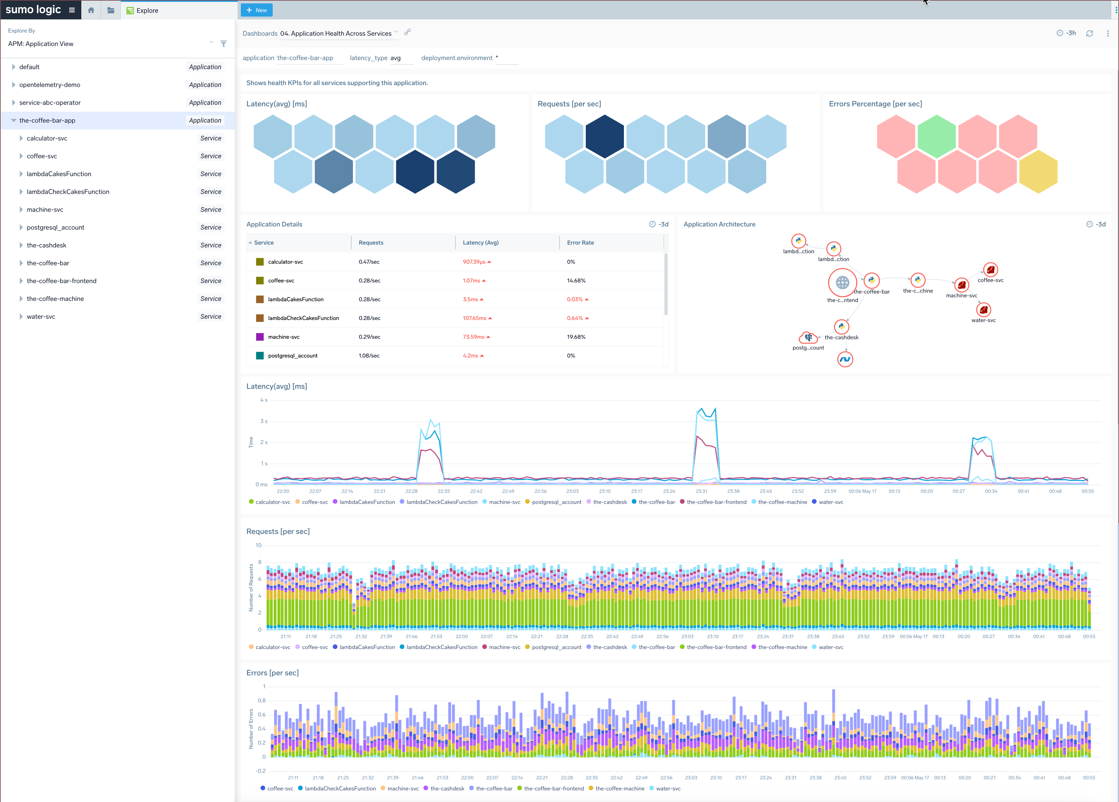
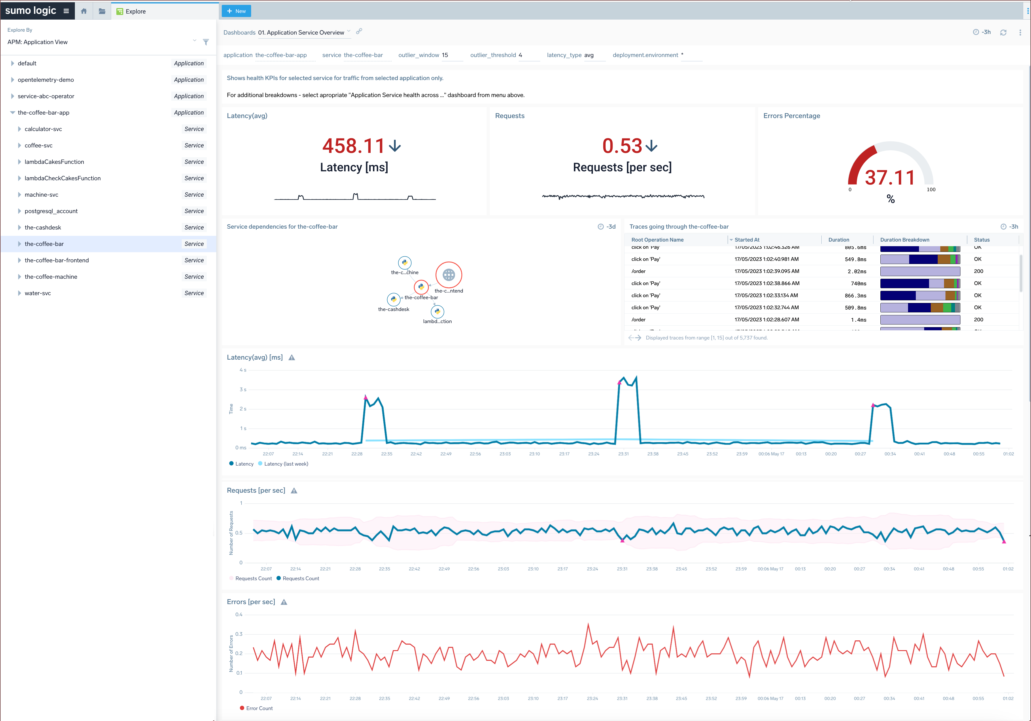
- The APM: Application View groups services into higher-level applications based on the
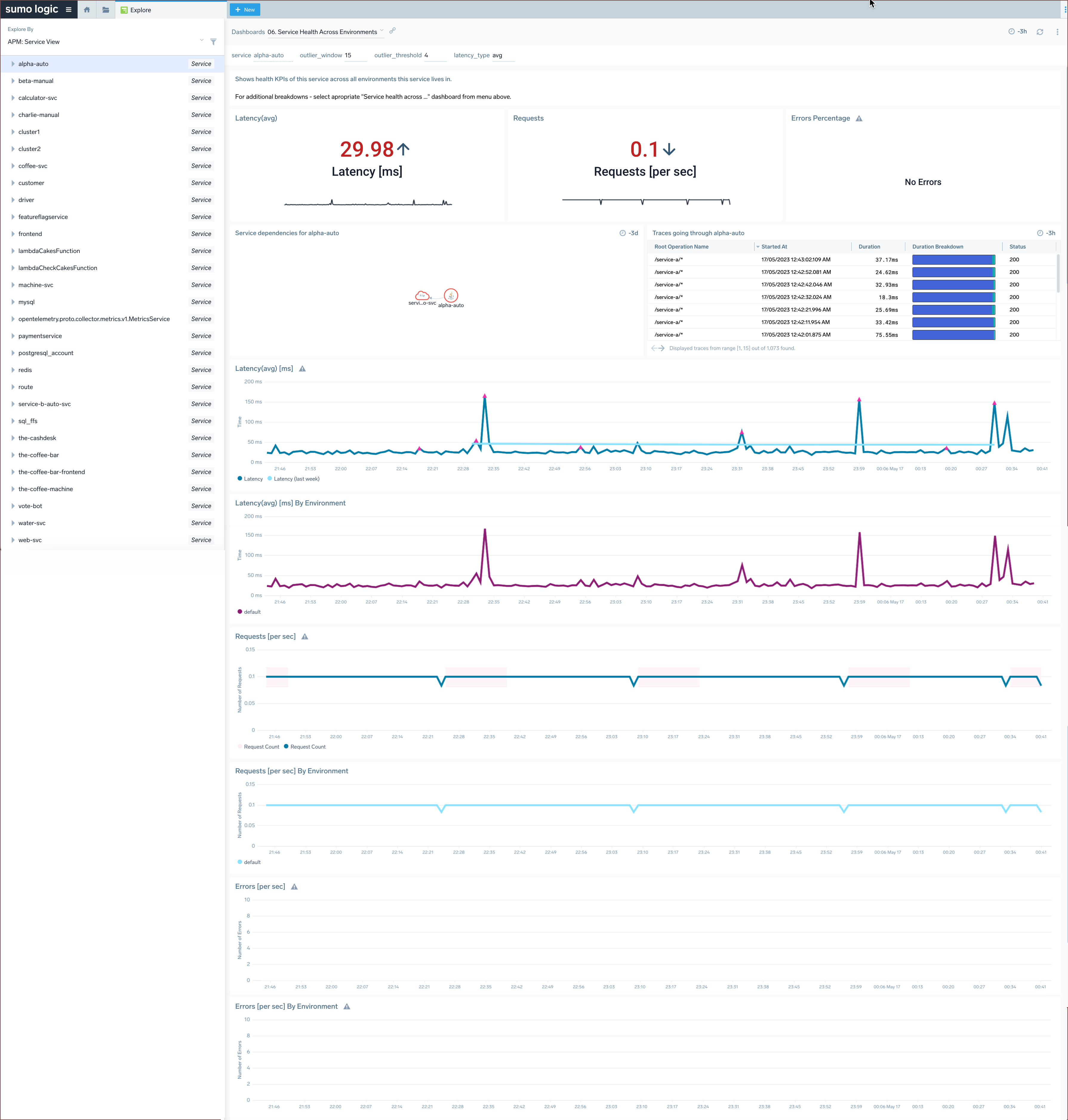
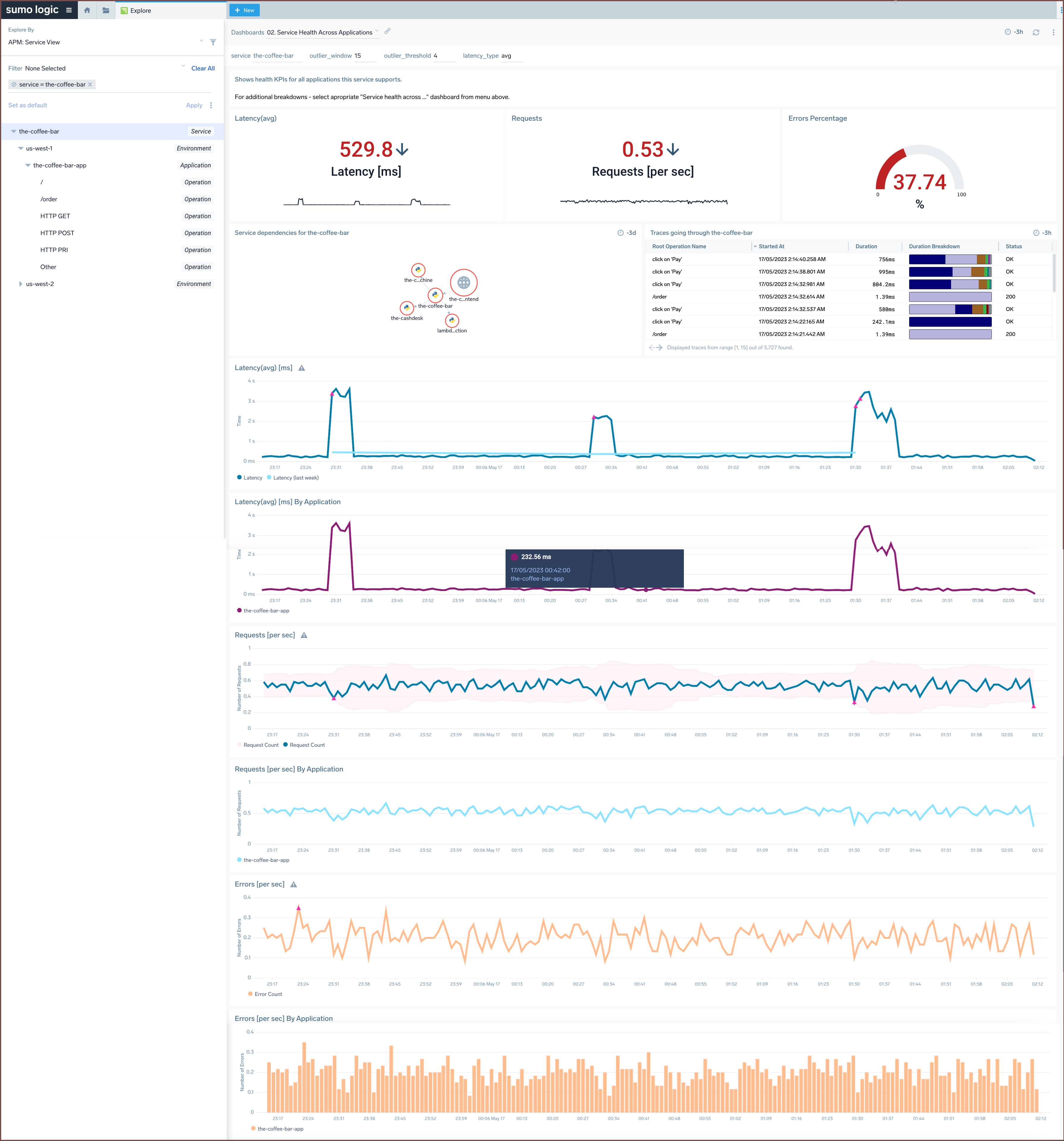
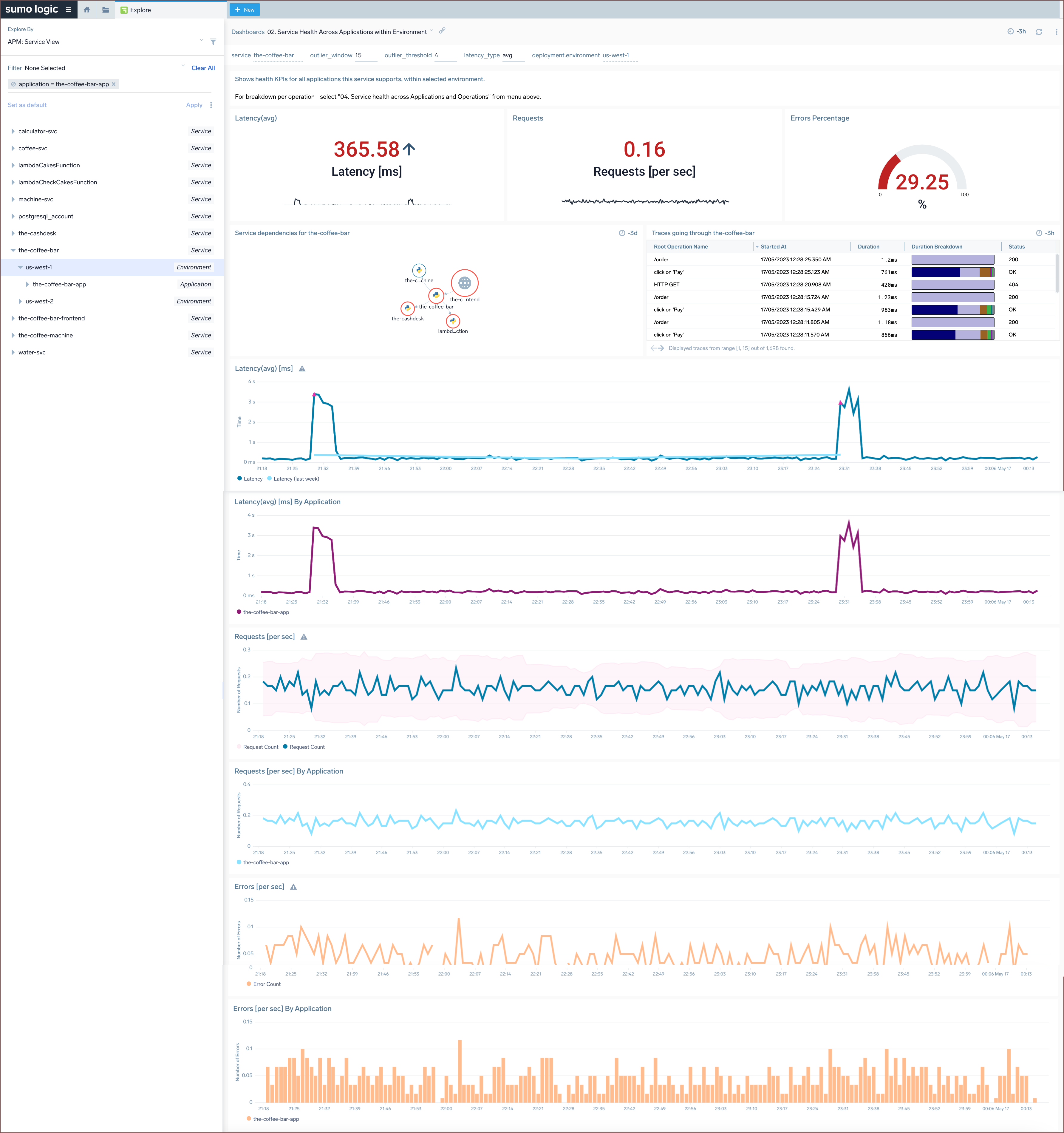
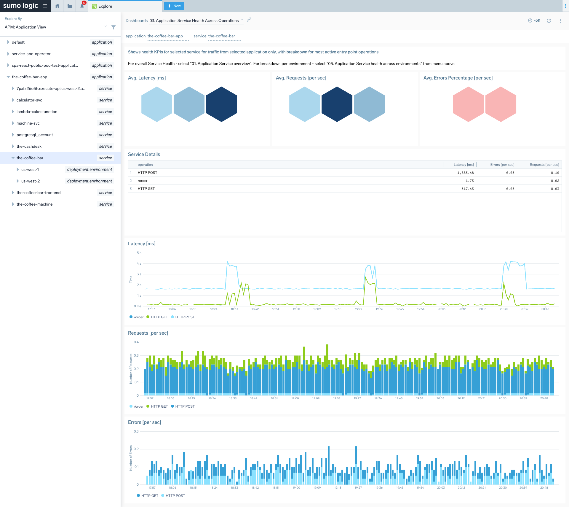
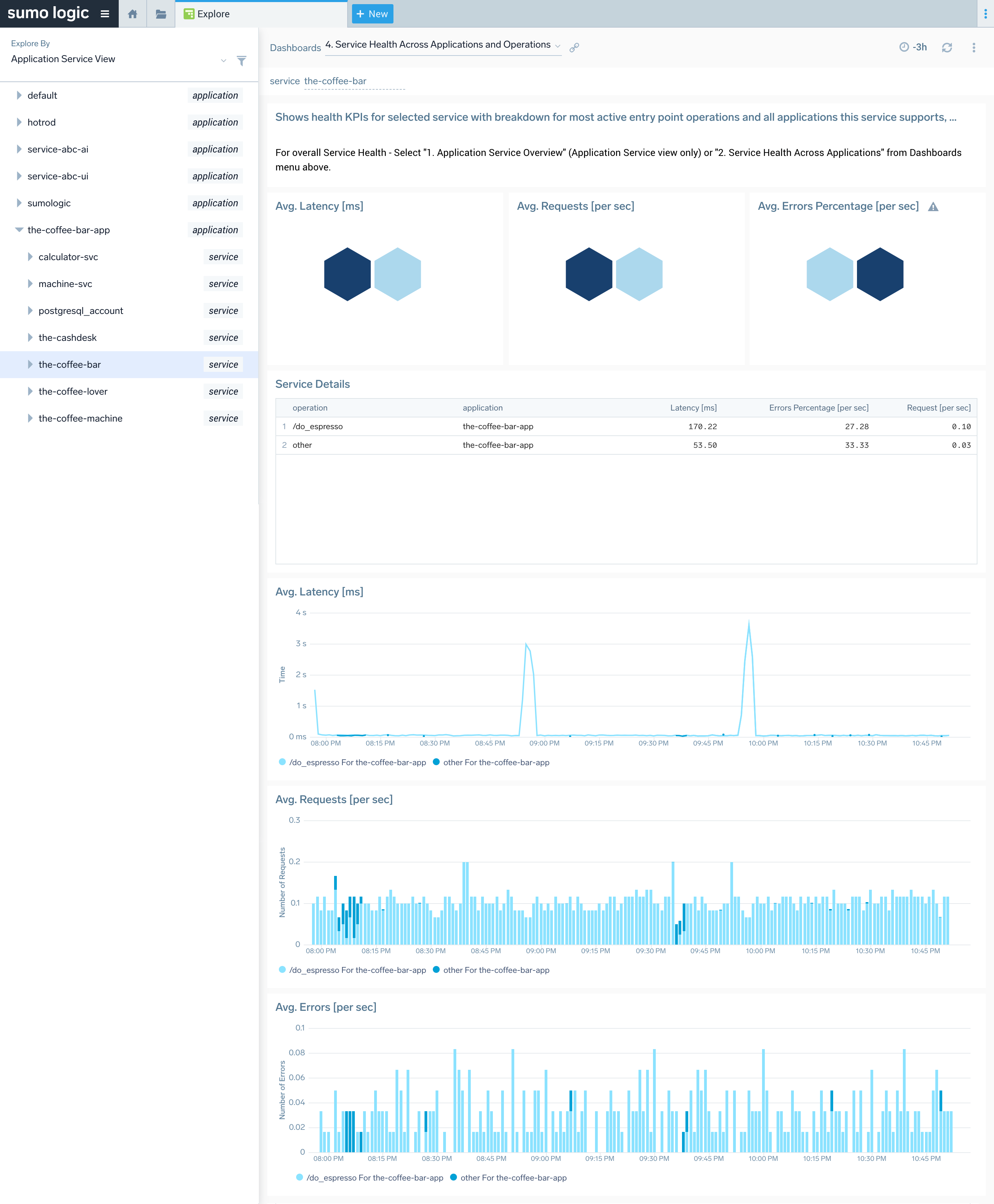
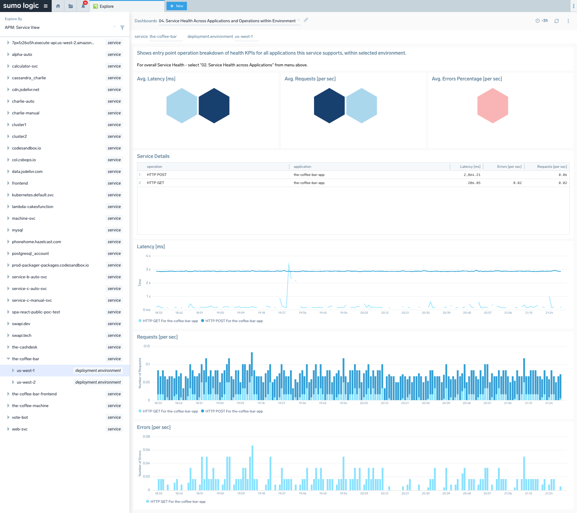
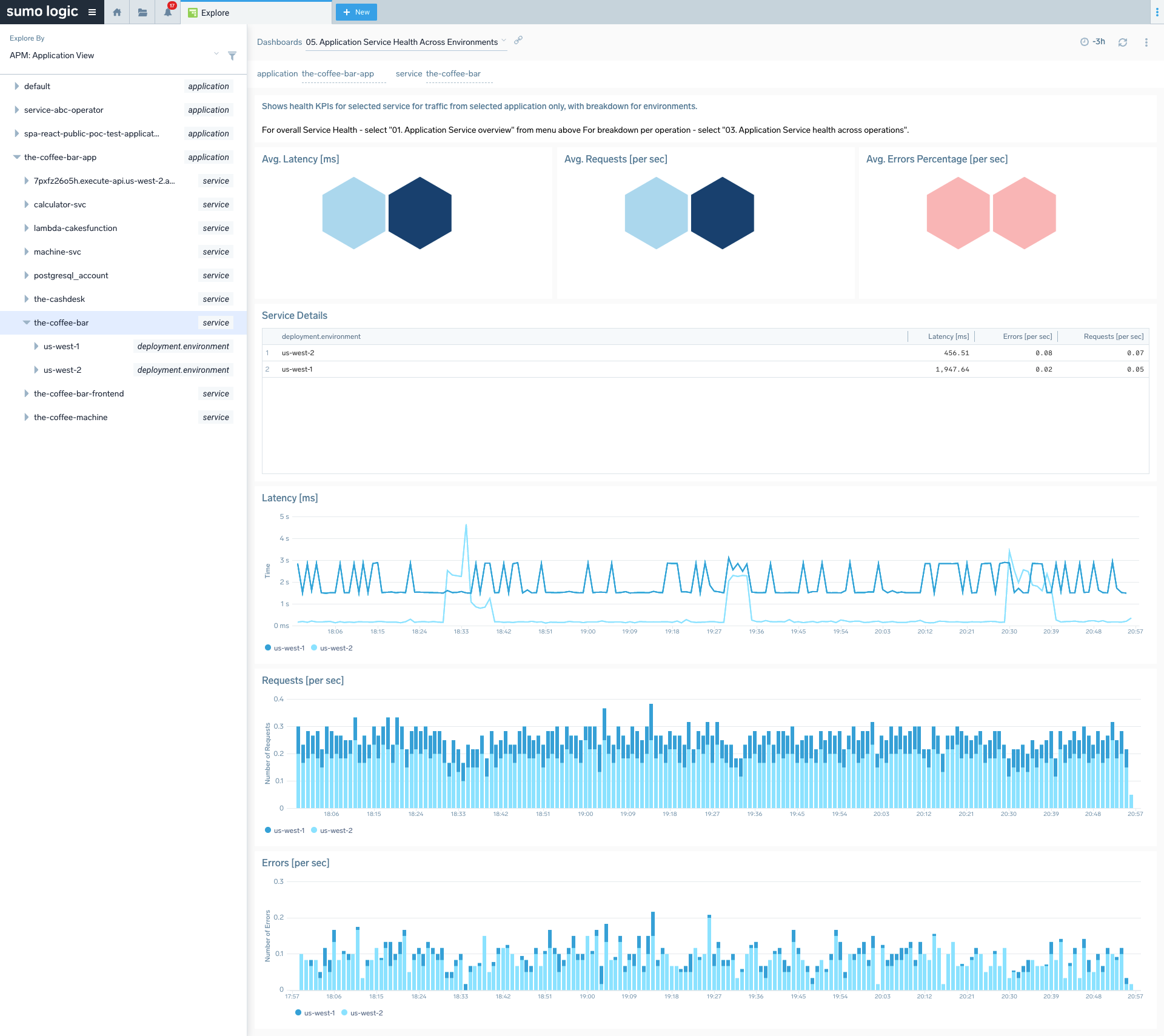
application=[app-name]custom tag that you may add to your tracing data if you want to leverage it fully. Without the tag, all services will belong to a "default" application. The fourth and last level of the hierarchy shows the top 50 most active operations executed on the service. See Working with Span attributes to learn how to customize your span attributes and set up application name. - The APM: Service View takes a contrary approach, displaying services by top level and breaking down their health by application. This view can be useful for shared services that support more than one application. The fourth level shows the top 50 most active operations performed on the selected service and application.
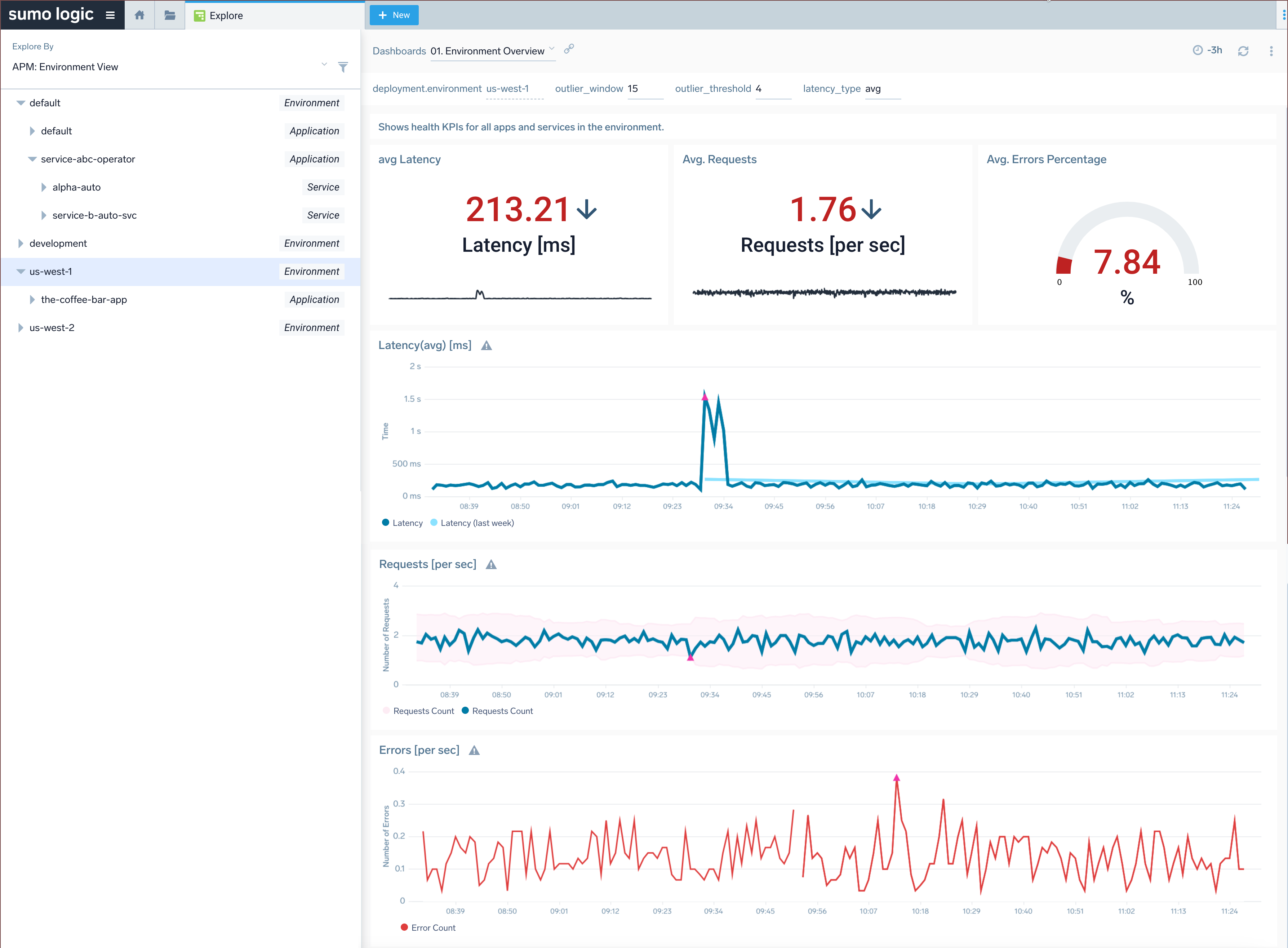
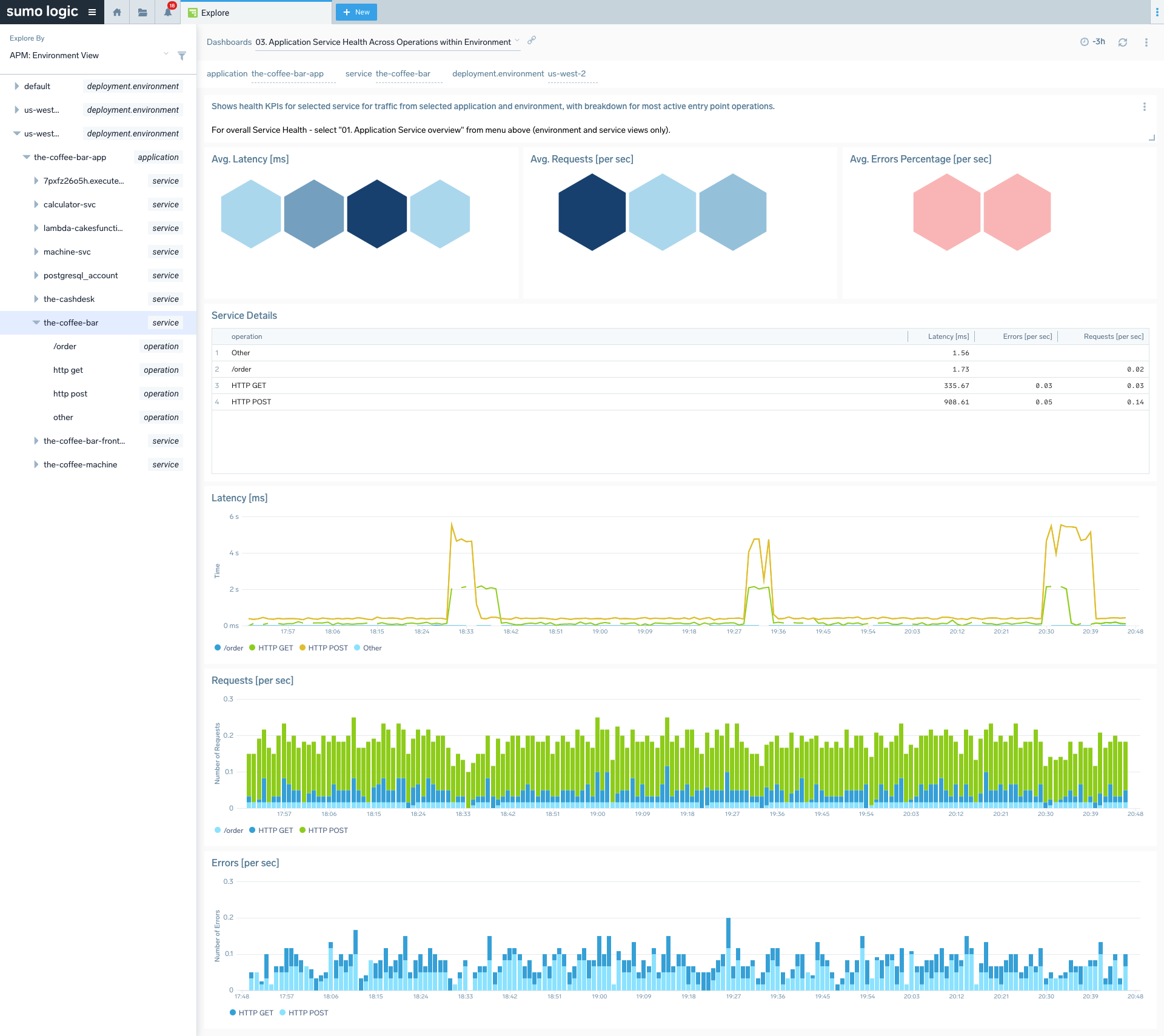
- The APM: Environment View displays environments at the top level and breaks down application health by environment (such as
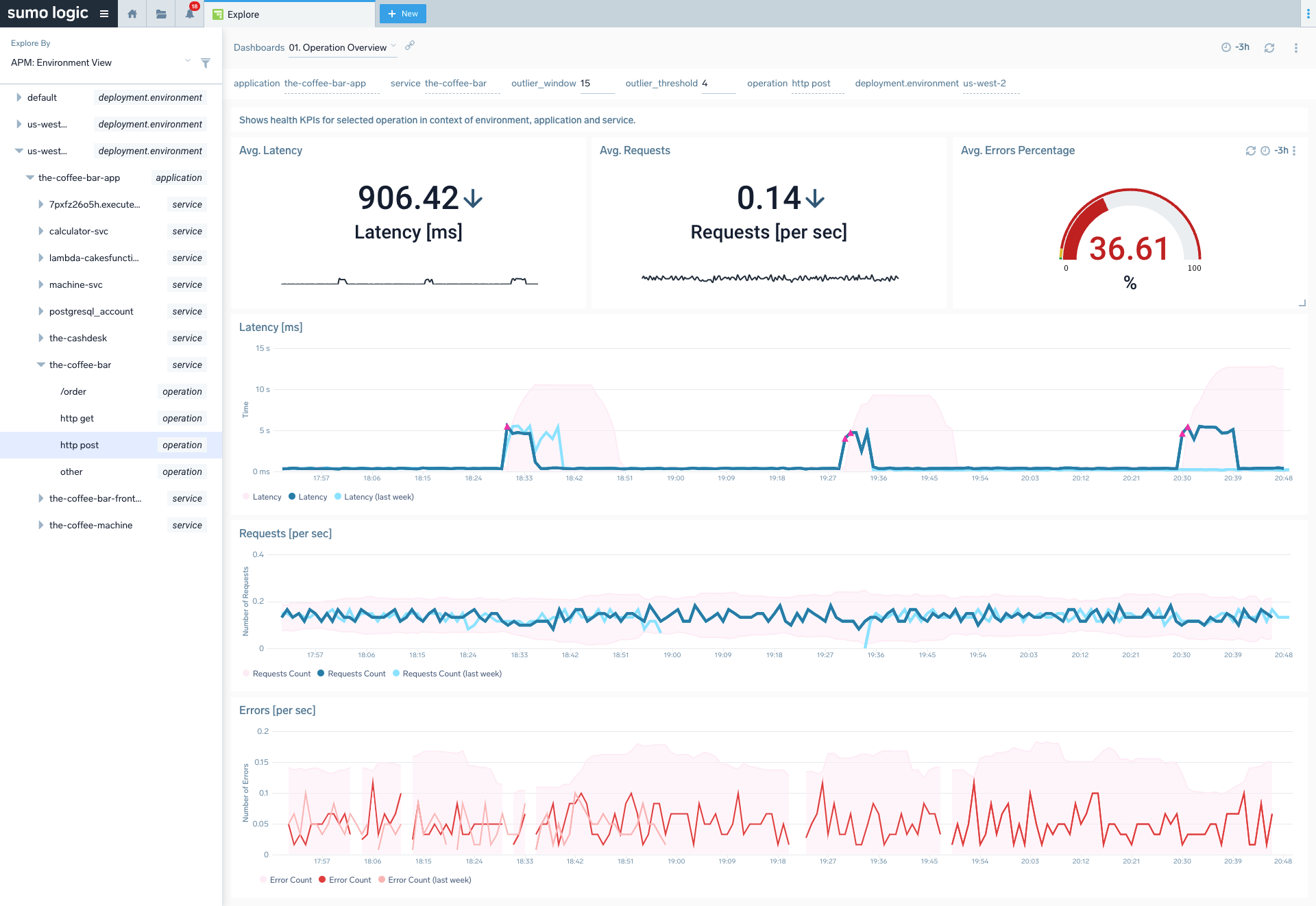
prodordev), with up to 10 values of deployment.environment tag. This view can be useful for understanding the top-down hierarchy of applications and services in a particular environment. The fourth level shows the top 50 most active operations executed on the environment, application, and service.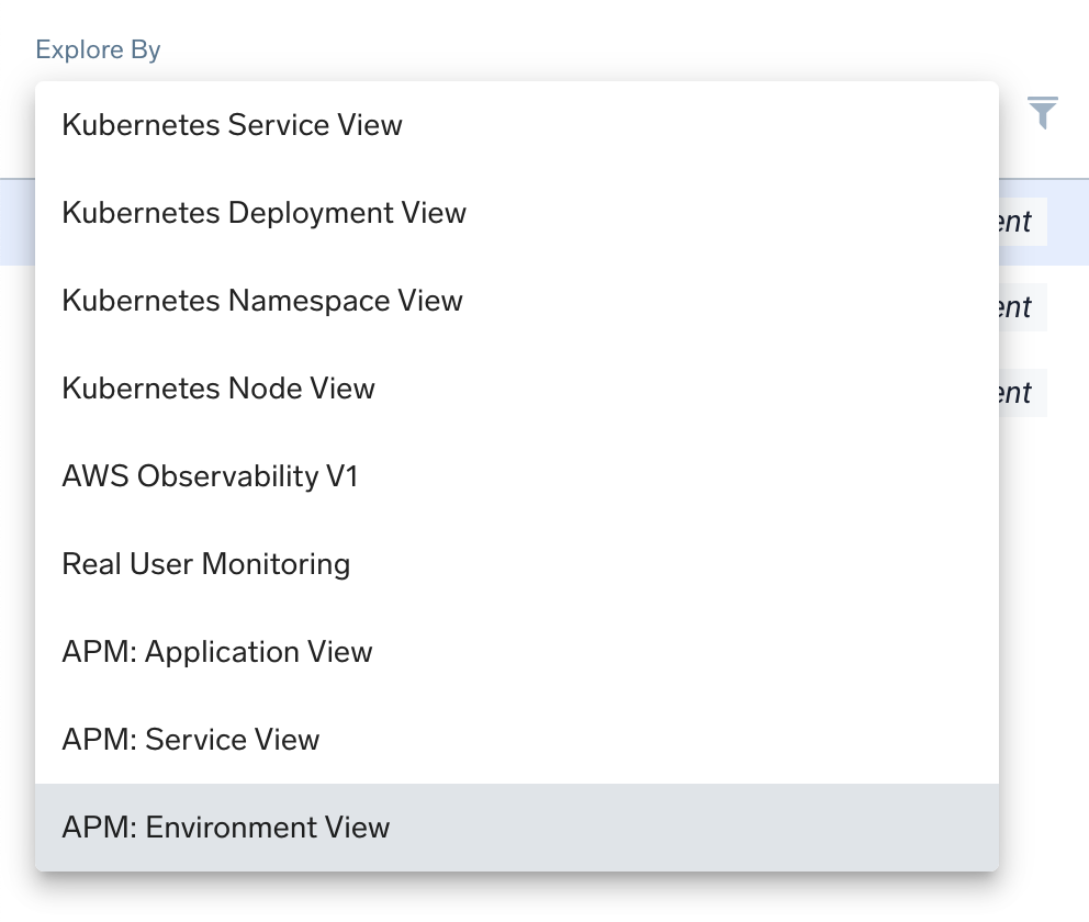
Services must be active within the last 15 minutes to appear on the list. Recent inactivity will result in a grayed-out list entry.
Each dashboard is a fully customizable set of panels based on automatically generated metrics using tracing data as input. You can get insight into microservice health by looking at stats from:
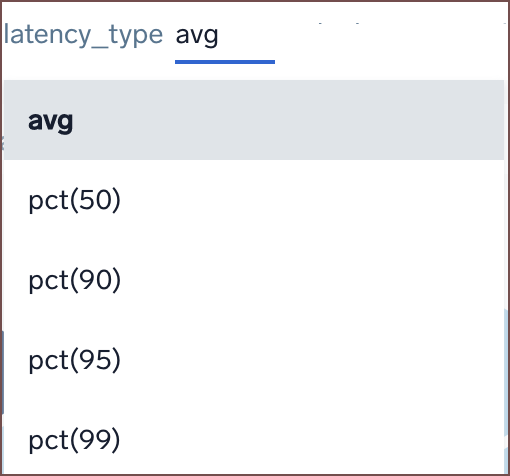
- Latency: (real-time average) the average time it takes for entry spans for that service to complete. Apart from average you can also select p99, p95, p90, p50 options in the
latency_typefilter to view other percentile aggregations. Percentile aggregations are based on the metrics histograms feature.
- Requests: (real-time counter) the number of entry spans reported by the service.
- Errors: (real-time counter) the number of entry spans for the service that finished with an error.
By clicking on any data point on the chart, you can view the side panel's Entities tab and drill down to related metrics or traces for the selected service.
Tracing metrics retention has default metrics retention.
Installing the Tracing App (Optional)
The Tracing - Application Services Health app is automatically installed for all users of your organization once Sumo Logic detects OpenTelemetry-compatible tracing data coming from your instrumented services. The content is placed in Sumo Logic Tracing - default dashboards inside the Admin Recommended folder and is automatically available for all users in the organization.
Do not modify or delete content in the Admin Recommended folder as it is maintained and updated automatically. If for any reason this gets removed, you can install the App manually from App Catalog.
To install the app, do the following:
- From the App Catalog, search for and select the Tracing - Application Services Health app.
- To install the app, click the Add to Library button and complete the following fields.
- App Name. You can retain the existing name, or enter a name of your choice for the app.
- Advanced. Select the Location in Library (the default is the Personal folder), or click New Folder to add a new folder.
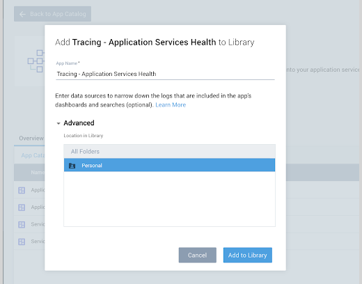
- Click Add to Library.
Once an app is installed, it will appear in your Personal folder or the folder you specified. From here, you can share it with your organization.
Dashboard Panels
There are three tracing-specific dashboard panels available out of the box: Services Map, Services List, and Trace List panels, which explore your application environment and review all traces from your Dashboard. Duplicate or add multiple panels with different filtering or queries to refine views and support your organization.
See the Dashboard guide for additional information and options to create panels, configure filters, create and filter with template variables from dashboard headers, and more.
Services panels
The Services Table and Services Graph panels display a services list and services map, respectively, for filtered applications and services, with the ability to explore the environment.
To add a Service Map panel to your Dashboard, see Services Dashboard Panels.
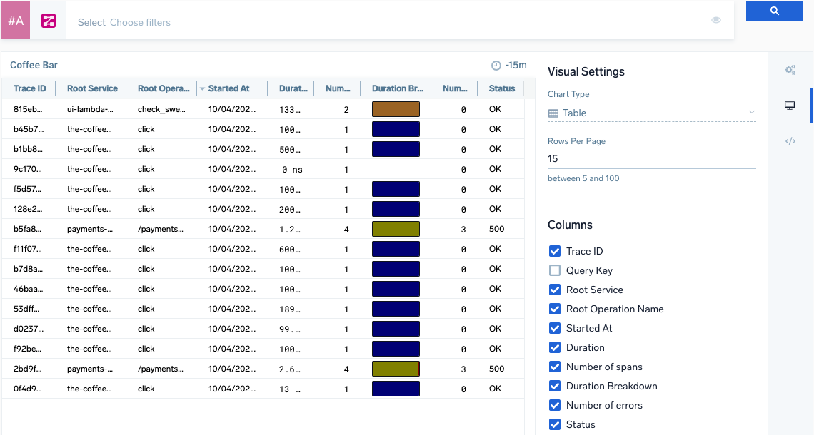
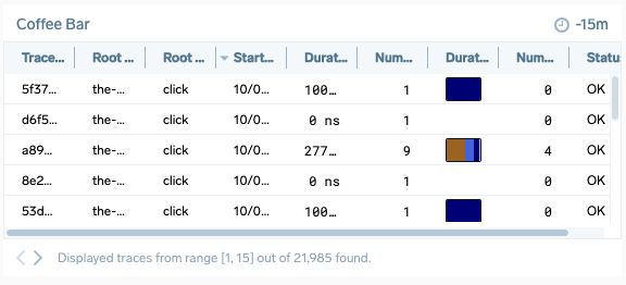
Trace List panel
The Trace List panel displays the Traces page table to give at-a-glance tracking for traces. To view deeper details, click a trace from the panel to open the Trace View.
You are limited to three Trace List panels in a dashboard.
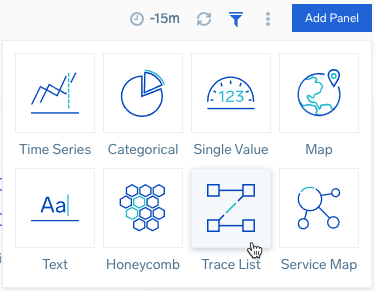
To add a Trace List panel to your Dashboard:
- Open or create a new Dashboard.
- Click Add Panel and select Trace List. Or select the Trace List option on a new Dashboard.
A panel configuration page opens.
- Configure a Trace query to search for desired set of traces.
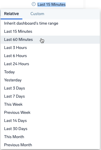
- Select a time range or create a custom range for the panel. You can set this when creating or at any time when viewing the Dashboard panel.
- The Chart Type is set to Table.
- Enter the Rows Per Page for the panel, between 5 to 100. The default amount is 15. The panel automatically paginates traces to browse through and view all traces.
- Select the Table columns of trace data to load in the panel:
| Column name | Example value | Description |
|---|---|---|
| Trace ID | ffaf2f69ee8ad0c1 | The unique identifier of the trace. |
| Root Service | api | The service that started the trace. |
| Started At | 07/27/2020 09:01:04.533 | When the trace started. |
| Duration | 12.582 ms | The amount of time the trace spans. |
| Number of spans | 35 | A trace consists of spans. This number tells you how many spans are in the trace. |
| Duration Breakdown | Each color indicates a service. The colors assigned to services are always the same on your account. You can change the color in the span summary tab after clicking on the individual span in trace view. Hover over to view a percentage breakdown of how long each span covers in the trace. 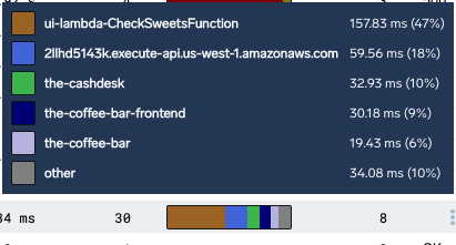 | |
| Number of errors | 0 | The number of errors in the trace. |
| Status | 200 | The HTTP status code of the trace. A menu is available in this column when hovering on a row. The menu has an option to Show similar traces. |
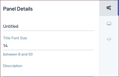
- Click the General tab to edit the Panel Details. Enter a name for the panel, set a Title Font Size, and add a short Description.
- Click Add to Dashboard. The panel loads in your Dashboard to review all traces according to the query.
Dashboard Examples
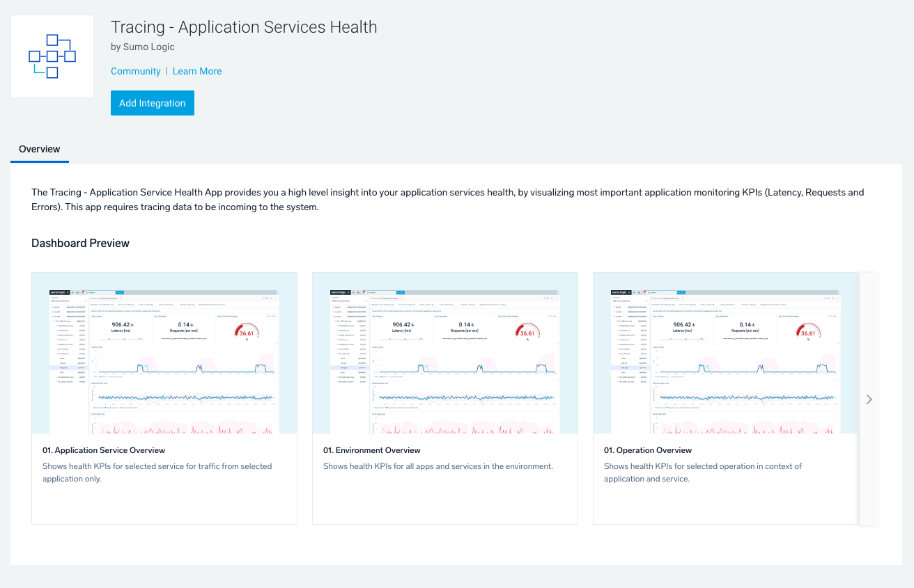
01. Application Service Overview
01. Environment Overview
01. Operation Overview
02. Service Health Across Applications
02. Service Health Across Applications within Environment
03. Application Service Health Across Operations
03. Application Service Health Across Operations within Environment
04. Application Health Across Services
04. Service Health Across Applications and Operations
04. Service Health Across Applications and Operations within Environment
05. Application Service Health Across Environments
06. Service Health Across Environments